
1. Confirm the placement
Record where the 320x50 banner will appear, the surrounding content, expected device conditions and the action it should support.
A 320x50 banner is a mobile display creative, 320 pixels wide and 50 pixels high. Design one readable offer for that shallow strip, confirm the accepted file and placement, then use FroggyAds to test source quality through useful customer actions rather than taps alone.
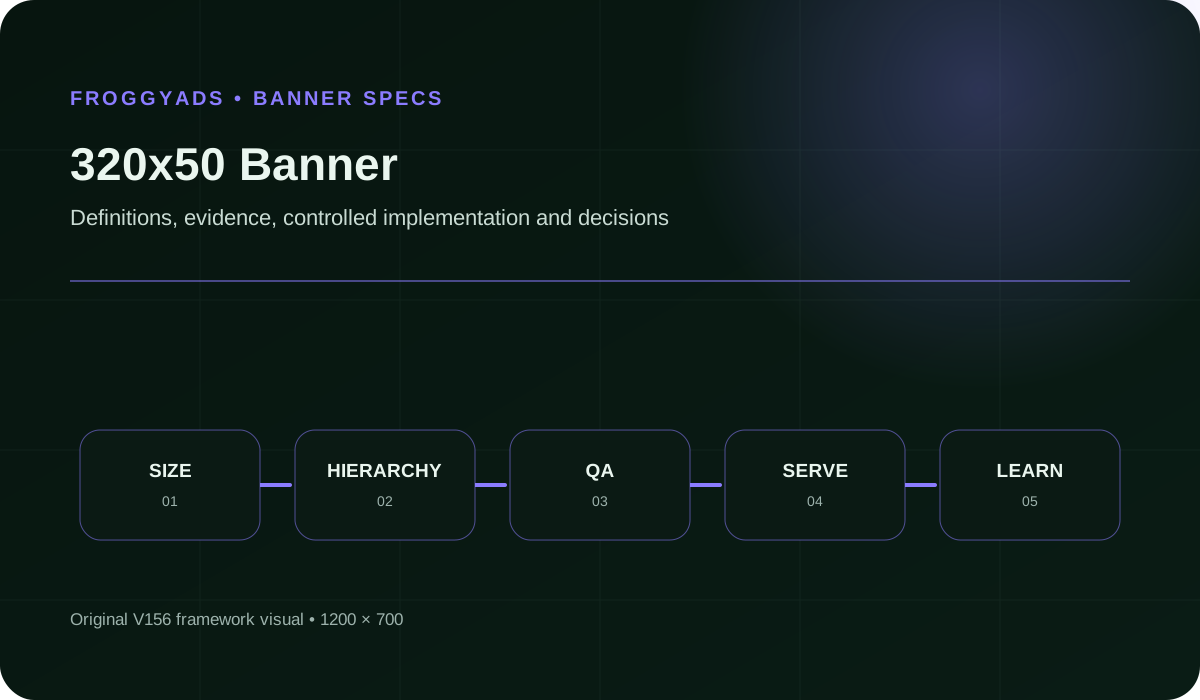
A 320x50 banner is a 320-pixel-wide, 50-pixel-high display creative commonly used in mobile placements. Its shallow height makes it useful for a brief offer or reminder, but unforgiving when copy, branding and buttons compete for space.
Start with the placement. Beside dense content, the message must be understood in a glance without demanding attention.
The landing page should continue the same promise and visual cue so a tap does not feel like a change of subject.
A disciplined 320x50 creative has one job: introduce an offer, bring a known visitor back, or prompt one immediate action.
Build around the shortest accurate statement you can make. A specific benefit or offer condition is more useful than broad claims.
A fixed 320x50 ad cannot fill a 320x100 slot by stretching. Prepare each size the placement accepts.
| # | Component | Operating requirement |
|---|---|---|
| 1 | Placement And Device Context | Record the live placement, surrounding content, expected device conditions and the single action the banner should support. |
| 2 | Exact Dimensions | Keep the 320:50 aspect ratio. Use the upload dimensions and pixel density the ad platform accepts. |
| 3 | Message Hierarchy | Use one truthful message and remove detail that belongs on the landing page. |
| 4 | Brand And Imagery | Keep one recognizable brand cue and use imagery only when it strengthens the message at native size. |
| 5 | Copy And Action | Keep copy legible at native size and make one deliberate action clear without crowding the banner. |
| 6 | File And Animation Rules | Meet the ad platform's file type, weight and animation rules, then verify the export. |
| 7 | Accessibility And Quality Review | Review readability, contrast, tap safety, policy compliance and the complete mobile path before approval. |
| 8 | Variant And Performance Record | Give each approved variant a stable ID linked to its creative, audience, placement and outcome record. |
Each review answers a different question, from placement fit to whether the live path can be measured.
We list 320x50 among our common Display sizes. Choose the available mobile targeting and source settings that fit your offer, then preview the exact creative and destination. FroggyAds gives you control over the purchase; the placement check establishes whether the small banner remains usable.
Create My Free Account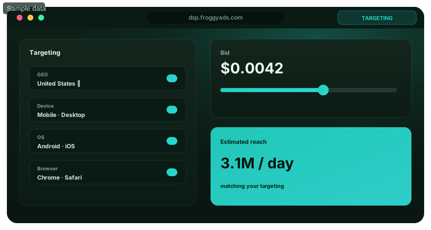
Record where the 320x50 banner will appear, the surrounding content, expected device conditions and the action it should support.
Design for the 320x50 slot. Export a higher-density image only when the ad platform accepts it.
Turn the offer into one truthful message. Keep secondary detail on the landing page unless omitting it would mislead.
Place the brand cue, message and action in a clear order, then inspect that hierarchy at native size.
Shorten copy or remove imagery until the brand, message and action remain distinct at served size.
Check the exported type, dimensions, bytes and animation against the ad platform's rules.
Review readability, contrast, motion, tap safety, claim accuracy and policy compliance before approval.
View the served ad in a realistic mobile placement, then check that the final URL continues its promise.
Launch clearly labeled variants, keep a stable ID for each, and change one major variable at a time when practical.
Wait for the stated outcome window, compare qualified results and refresh or pause weak combinations.
Choose the accepted customer action before launch and compare its cost across equivalent campaign records. Keep viewability and tap quality as diagnostics. A response-per-viewable-impression measure requires compatible exposure, action and attribution populations; otherwise report those measures separately. File weight remains an export requirement, not a campaign outcome.
| Measure | Definition discipline | Review cadence |
|---|---|---|
| Qualified Mobile Response Per Viewable Impression | Use only actions linked to a compatible viewable-exposure population and one stated attribution window; otherwise report accepted actions and viewability separately. | After the stated action window, with delivery checked during launch |
| Viewable share | Measurable impressions that meet the measurement provider's viewability definition divided by all measurable impressions. | During delivery and after placement or source changes |
| Qualified CTR | Qualified clicks divided by the stated eligible-impression base. Define which clicks qualify and keep the base consistent. | During delivery, using one fixed eligibility rule |
| Qualified visit share | Qualified mobile visits divided by recorded taps, using the stated qualification, invalid and duplicate rules. | During mobile traffic-quality review and after placement changes |
| Post-Click Conversion | Qualifying actions divided by eligible post-click visits within the stated attribution and maturity window. | After the stated attribution and maturity window |
| File Weight | Final export bytes compared with the ad platform's current file-size limit. | Before upload, after a changed export and when placement limits change |
Read these measures together. Strong clicks with weak post-click action can expose a mismatched promise, audience or page.
A 320x50 file is a Display banner, not a Push creative, Native asset set or Pop destination. Confirm its upload requirements in your selected campaign. Use FroggyAds to control the media allocation and retain source-level results while the same mobile offer is tested.
Create My Free Account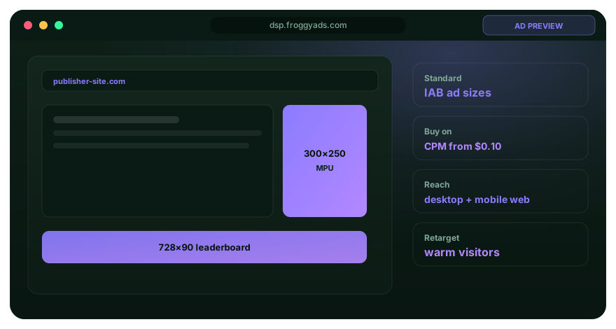
Lead with one accurate trial condition and repeat it at the top of the sign-up page.
Use a service-and-location message only when targeting and the landing page support that geography.
Do not squeeze a leaderboard into 320x50. Rebuild the hierarchy and remove secondary desktop detail.
If copy is hard to read at native size, remove secondary words or rewrite the message. Do not shrink type merely to preserve every line.
Crowded or misleading controls can invite unintended taps. Review tap timing and post-click activity by placement; a weak visit does not prove an accident.
Check text, brand cues and the action against every background frame at native size. Replace combinations that lose legibility.
Preview the served banner near browser and app controls on representative screens. Reject any placement where interface elements obscure the message or invite a wrong tap.
Meet the file and animation limits, then check that the useful message appears promptly in the mobile placement.
Most 320x50 problems are prioritization problems. Make the campaign decision before polishing the design.
Brief the audience, placement, promise, assets, URL and success event. Preview at served size.
Set a loss limit before buying impressions. For a trial offer, judge affordable cost by qualified sign-ups, not taps.
Test one message change with a fixed audience and source mix. Save each version; wait for the outcome window.
Bring a tested 320x50 creative, a matching mobile destination and a clear acceptance rule. Create your FroggyAds account and authorise the first campaign allocation. Review which sources produce useful enquiries, registrations or purchases before deciding that a low cost per tap deserves more spending.
Create My Free Account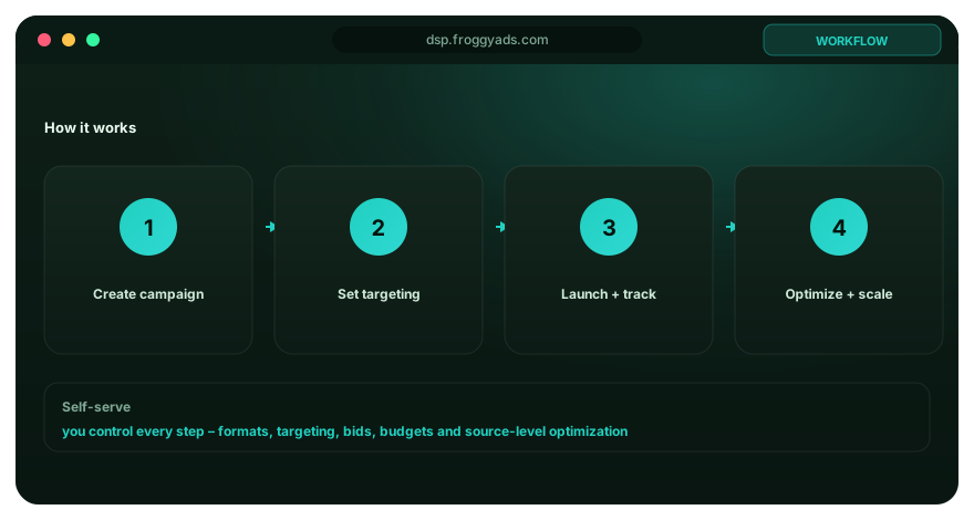
Choose 320x50 when the offer can survive aggressive editing. It is a poor fit for explanations, comparisons or several actions.
We list 320x50 among our display sizes. Confirm supply and file acceptance for your target, then test one mobile message.
Use what happens after the tap to decide whether the message, audience or page needs the next change.
Resolve any uncertainty before trafficking. This small format leaves little room for a mismatch.
View the export on a phone. Check the space around text, logos and any button treatment.
Open the final URL on the same device and confirm that the offer, first screen and action match.
Save the approved file, destination, tracking parameters and test label as one record.
A 320x50 banner is 320 pixels wide and 50 pixels high. Use this shallow format for one short offer, a recognizable brand and a clear action in an eligible mobile placement. We list 320x50 among our common Display sizes. Check the campaign's available inventory and design the mobile version for its actual height rather than reducing a desktop ad until its text becomes unreadable.
Use a short headline, strong contrast, and a type size that survives viewing on an actual phone. Remove secondary claims instead of shrinking them, and test the exported asset rather than only the design canvas.
Place it where it is easy to distinguish from the message and safe from common interface edges. Keep enough breathing room for a deliberate tap, then test the whole placement on representative screens.
Follow the asset dimensions accepted by your actual campaign. A high-density image and its displayed size are different specifications, so do not assume a 640x100 file will be accepted for a 320x50 placement. Preview the exported asset on the intended phone screens, checking sharpness, cropping and legibility. Confirm uncertain requirements in FroggyAds before producing every variation; higher pixel density does not create more room for copy.
Review qualified actions, accidental-click signals, landing engagement, cost, and post-click quality. A high click rate is weak evidence when visitors immediately return or never reach the intended step.
Yes, when the placement accepts it and the motion supports a simple message. Keep the sequence brief, make the final frame understandable on its own, and respect file-size and flashing limits.
Crowded controls, misleading button shapes, placement near navigation, and sudden movement can all invite unintended contact. Inspect tap timing and post-click behaviour, then change the layout or inventory when the pattern is clear.
Desktop copy and visual hierarchy usually become unreadable at that height. Rebuild the mobile version around one promise, one recognizable image or mark, and one tap target designed for the smaller context.
Pause when invalid or accidental traffic rises, the landing page fails on mobile, or the message produces the wrong response. Use a written limit for cost and quality so the decision is not delayed by a flattering click total.
Prepare an accepted 320x50 asset and a mobile landing page that continues its offer. Set the relevant device and location targeting, a CPM bid and a separate campaign budget, then test conversion tracking before submission. Compare qualified outcomes by source and creative after approval. Our published Display entry bid is $0.10 CPM, not a guaranteed price or available volume for every 320x50 placement.
These references describe platform-specific rules and measurement terms. Your publisher, ad platform and file type govern approval.
Complete this worksheet before approval. Each answer should be clear to someone outside the campaign team.
Name the mobile placement, surrounding content, device conditions and supported action.
Record the 320x50 slot and accepted upload dimensions. Keep the aspect ratio; verify any higher-density export.
Write the single promise, including any condition needed for accuracy.
List the required brand cue and wording, then state whether imagery still helps at native size.
Write the final banner copy and action, then record the mobile URL where the same promise continues.
Confirm the ad platform's accepted file type, weight, animation and dimensions.
Record the native-size checks for readability, contrast, motion, tap safety, claims and policy.
Record each variant ID, its major change, the outcome window and the pause or refresh rule.
Choose a mobile audience, cap the test spend and compare qualified responses by source before expanding.
Create My Free AccountA 320x50 canvas has 16,000 pixels and a 6.4:1 aspect ratio. A 640x100 image has the same shape but four times the pixel count. If an accepted high-density file is displayed at 320 by 50 CSS pixels, the message still occupies the same physical layout area in that browser configuration. More samples may help image sharpness; they do not create another line of copy or prove that the larger file is accepted by an ad platform.
MDN explains devicePixelRatio as a relationship between physical and CSS pixels. Browser zoom and display conditions matter. Keep the upload specification, delivered layout size and device scale in separate fields of the creative record. Do not rename a 640x100 file as 320x50 or assume that changing its filename changes its dimensions. Check our campaign's accepted asset requirements before producing high-density alternatives.
Executed synthetic browser example, not a FroggyAds delivery test: we placed the same 640x100 inline image inside an explicitly sized 320x50 link. At emulated device scale factors of one and two, the measured link remained 320 by 50 CSS pixels. The example demonstrates the distinction between asset dimensions and layout dimensions; it does not establish image-upload acceptance, real-phone sharpness or behaviour inside a publisher's advertising container.
For your own preview, record the file dimensions, link or container rectangle, viewport and any scaling applied by the delivery system. Inspect the complete asset, not just its centre. An apparent mobile fit can come from clipping rather than a valid resize. If the container is smaller than the approved creative, ask for the placement behaviour or use another supported composition. Our Display guidance establishes the common 320x50 size, not a promise that every mobile page has room for it.
A button-shaped mark inside a flat banner image is artwork; the real interactive target is determined by the ad implementation. In our synthetic preview, a small drawn action mark was inside a link covering the entire 320x50 image. A simulated click away from that mark still activated the link. That result describes our fixture, not every FroggyAds placement. Review the actual implementation and surrounding controls rather than deciding tap safety from the artwork alone.
W3C's minimum target-size guidance uses CSS-pixel dimensions and includes exceptions. A measured rectangle alone is not an accessibility certificate: overlapping controls, spacing, keyboard access and the surrounding experience still matter. Do not draw a fake close button, navigation arrow or other control that performs a different action when tapped. Keep the banner's invitation clear, and have the responsible publisher or integration owner resolve misleading placement behaviour.
For a fictional horizontal draft, eight pixels of padding at each side, a 40-pixel brand area, two eight-pixel gaps, a 168-pixel message area and an 80-pixel action area total 320 pixels. Those are illustrative design allocations, not mandatory safe areas or a proven layout. A longer advertiser name or a necessary offer condition may require a different composition. Approve the wording and hierarchy at served size before multiplying colours, images or animation versions.
Decide which information cannot be omitted without changing the offer. A trial, discount or appointment message should remain accurate when read alone. The landing page can provide detail, but it cannot repair a misleading headline that earned the tap. For animated files, keep a recognisable advertiser and meaningful message at the first usable frame and at rest. Check the final exported file against the selected campaign's current type, size and motion requirements; another platform's file limit is not automatically ours.
Fictional campaign records, not customer results: source A spends USD 48 and records 200 taps, 120 qualified landing visits and eight accepted actions. Source B spends USD 50 and records 120 taps, 100 qualified visits and ten accepted actions. The observed spend per tap is USD 0.24 for A and approximately USD 0.42 for B. Yet media cost per accepted action is USD 6 for A and USD 5 for B. These calculated click costs do not change Display's CPM billing model.
Source A's cheaper taps are not enough to justify choosing it. The examples assume the same qualification definition and observation window; they do not establish a statistically reliable winner or profitable acquisition. Lead or order value, refunds and follow-up costs are still unknown. Keep those limits visible when using the comparison to decide whether another test is warranted, rather than converting a small fictional ratio into a buying benchmark.
In the fictional records, qualified visits equal 60% of source A's recorded taps and about 83.33% of source B's. The gap is a diagnostic question, not a measured accidental-tap rate. Reports can use different event definitions; repeated taps can map to one visit, analytics collection may be incomplete, and destination or redirect problems can interrupt the route. A visitor who declines optional measurement should not automatically be labelled invalid traffic.
Investigate what the measurement can actually show. Check the recorded tap, destination request, relevant consent state, analytics event and customer action using permitted test data. Reconcile comparable timestamps and identifiers where available. Keep the missing or unmeasurable population visible instead of forcing report totals to agree. Source exclusions should follow a verified delivery or quality issue, not a guess that every short visit was an accident.
A viewable-impression figure comes from the measurement provider's eligible and measurable population. An attributed customer-action total may use a different population or time window. Google's Active View metric definitions illustrate the distinction between eligible, measurable and viewable impressions. Unless exposure and action records can be joined under compatible rules, report accepted cost and viewability separately rather than inventing a response-per-viewable-impression rate.
Use FroggyAds source reports to retain the buying context while your customer system supplies the accepted action. Keep creative version, source, device context, media spend and the acceptance window together. This is more actionable than an account-wide tap average: you can inspect a weak combination, test the destination or restrict an eligible source without losing the explanation for the change.
Open the actual destination from the approved creative on a representative phone or inspected placement. Check that the offer, advertised condition and next action are visible without relying on a desktop layout. A booking prompt should lead to the relevant booking path; a product offer should not arrive at an unrelated catalogue. Test both the displayed form error and the receiving system's response with fictional information, keeping real customer records out of screenshots and campaign URLs.
Inspect the moments after the first screen as well. A keyboard can obscure a form action, a required field can be awkward to enter, or a confirmation page can lose the identifier needed for reconciliation. Record the device, browser and destination build that failed. A device label in targeting is not proof that every form on that device works; fix a shared destination fault before blaming each source that encountered it.
Give the creative owner the final export and its acceptance requirements. Give the destination owner the promise, device conditions and tested form or checkout route. Give the analyst the accepted-event definition and permitted identifiers. The useful output is a short record of pass, repair or unresolved status with a reason, not a long checklist in which every box is marked approved by default.
The emulated browser fixture in this guide covers only image-versus-layout dimensions and one controlled link hit area. It does not test your ad account, a customer's transaction, consent configuration or the publisher's interface. Repeat the relevant checks in the real campaign workflow. When a requirement is unknown, hold that part of the launch or request clarification rather than treating the existence of a 320x50 image as evidence that the whole route is ready.
Our pricing page separates the USD 50 minimum account deposit from the published USD 0.10 Display starting CPM. Neither is a guaranteed rate for all mobile-banner placements or the complete cost of your test. Allocate media separately from creative work, destination repairs and customer follow-up. Decide which question the next spend will answer: a source comparison, one message change or verification after a known repair.
Choose FroggyAds when you want that mobile Display purchase under your own campaign and source controls. Keep a working creative and destination identifiable, limit the first allocation and review accepted outcomes after the agreed window. Expand the combinations supported by the result. When the next purchase changes the device mix, placement or destination, retain a separate comparison period instead of assuming that the earlier tap rate forecasts its value.
Launch when the accepted file fits the actual mobile placement, the message is readable and the tap leads to a working destination. Confirm the real interactive area and the customer action you will measure. Use FroggyAds Display controls to test that combination, then judge sources through accepted outcomes rather than tap volume alone.