
Banner Design: Layout, Readability and Production Workflow
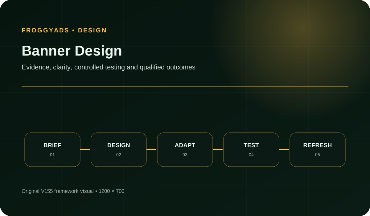
Banner design brings a verified offer, a recognisable brand and a clear action together inside a specific advertising placement. Start with the message the customer needs, build the composition for its actual size, then use FroggyAds to test the approved creative with targeting, budget and source controls.
Design the invitation your next customer can understand
A banner has to make a useful introduction before it can earn a useful response. The designer's job is not to fit the entire sales page into a rectangle. It is to make the offer recognisable, communicate the most relevant supported benefit and show what the visitor can do next. Your media buyer then needs the exact approved asset and a destination that continues that invitation.
Choose FroggyAds when you want to put that design into a campaign you can manage directly. Our Display advertising workflow connects your banner with available desktop and mobile web inventory, campaign budgets, targeting and source decisions. This guide concentrates on the composition and production of the banner itself; our display ad design guide covers keeping a wider campaign's assets and destinations consistent.
1. Give the designer an offer, not a collection of adjectives
Begin the brief with the product or service being advertised, the intended customer, the relevant benefit and the evidence supporting it. Add any condition that could change a buying decision. A request to make something premium, exciting or high converting does not answer those questions. A designer who knows the actual offer can use visual emphasis to explain it instead of decorating an assumption.
Separate required content from optional supporting detail. The product identity and an important eligibility condition may be essential; a second photograph, a slogan or a decorative badge may not be. Agree which elements may be removed in smaller versions before the artwork is built. Otherwise, the smallest export often becomes a crowded compromise that nobody would have approved as the starting concept.
Name the next screen as part of the brief. A product-details visit needs a different invitation from a quotation request or a trial registration. Share the destination with the designer and the person reviewing ad copy. When the visual team can see the real route, it is easier to spot a button treatment or promise that suggests an action the destination cannot provide.
2. Identify the advertising placement before choosing a template
A website hero, a social profile cover and a paid display banner can all be called a banner, but their jobs and delivery requirements differ. For a FroggyAds Display campaign, use the accepted advertising dimensions and creative type for that campaign. Do not assume a template labelled web banner is ready for an ad upload just because the artwork looks suitable in the editor.
Inspect the intended context wherever a representative preview is available. Is the message beside dense article text, below a product comparison or inside a narrow mobile page? Those contexts change how much explanation the design can carry comfortably. They do not establish who will see the final campaign or guarantee a level of attention. Treat the preview as a composition check, then use actual delivery evidence after launch.
Make an early decision about the element that must survive at the smallest served size. That could be a product detail, a short benefit or a brand cue, depending on the brief. When all three need more space than the placement offers, revise the message or the eligible size selection rather than shrinking the entire concept. Our banner ad design guidance provides another route into that creative decision.
3. Worked layout brief: show the feature instead of inventing a benefit
Fictional teaching brief, not a customer case: an online shop sells a reusable lunch box with a removable divider. The assumed product record supports the removable-divider feature. It supplies no evidence for insulation, leak resistance, health benefits, a discount or a delivery deadline. The desired action is to inspect the product details. These assumptions exist only to demonstrate a design review.
Proposed headline: Make room for the lunch you pack.
Supporting line: Arrange the compartment with a removable divider.
Action: View the lunch box.
Product view: show the open box with the divider clearly identifiable.
Brand cue: use the shop's approved mark without letting it obscure the feature. This is an original text description of a layout, not finished artwork or a tested advertisement.
The headline introduces a practical use, and the product view explains why the feature matters. An isolated closed-box photograph would hide the point of the message. A scene showing soup in an open bag could imply leak resistance that the brief does not support. Rejecting that image is a factual design decision, not a preference for one photographic style over another.
Review the hierarchy by asking what an unfamiliar reader would recognise first. They should be able to identify the product, understand the divider feature and predict that the click opens product information. If the decorative background receives more attention than the compartment, simplify it. If a material product condition is absent, add it or narrow the promise. No comprehension study or campaign result is claimed for this exercise.
Bring a clear banner concept to FroggyAds
Turn the approved offer into an eligible Display campaign with a budget and audience you can supervise. Keep the product, message and destination connected from the first upload.
Create My Free Account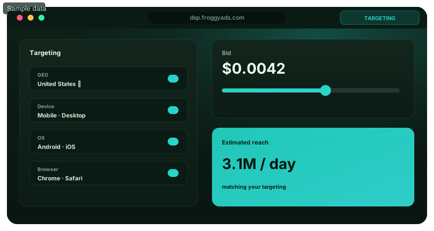
4. Set a reading order that still works at served size
Use contrast in size, weight, spacing and position to create a clear order rather than making every element equally prominent. Start with one main visual or message. Let supporting copy resolve the detail that matters next, and make the action recognisable without turning it into a competing headline. A layout with four equally strong focal points asks the reader to do the editing you should have done.
Review the export at the size the placement will actually display. An enlarged artboard can conceal cramped type, weak strokes and awkward line breaks. Pay particular attention to short words stranded on a final line and to a qualification separated from the claim it limits. Rewrite or rearrange before choosing a smaller type size. There is no single font size that makes every banner, typeface and device readable.
For the fictional lunch-box concept, the removable-divider line may explain the image well in a roomy composition. In a shallow placement, a shorter supported headline and a clear product view may communicate the same idea more effectively. Preserve the meaning rather than a fixed number of words. Keep the full product description on the matching destination, while retaining any condition needed to prevent the advertisement itself from misleading.
5. Choose imagery that proves the same product story
Select the image for its role in the message. A feature demonstration needs a view in which the feature can be recognised; a product-selection campaign may need the exact model and colour being offered. A lifestyle photograph can establish context, but it should not introduce an accessory or capability that the buyer will reasonably expect to receive when it is not part of the offer.
Crop around the information the advertisement depends on. In the lunch-box exercise, do not trim away the divider while leaving a large area of decorative food photography. Leave enough of the object visible to understand its shape and use. Where a close crop would make the product ambiguous, choose another photograph or a simpler composition. Enlargement cannot recover a detail that is missing from the source image.
Keep the image's permitted use with the production record. Confirm the relevant licence and any approval needed for people, logos or other protected material before publication. A file being available in a shared folder does not establish permission for this campaign. When a generated or edited image is used, review the depicted product carefully: a plausible extra compartment or accessory can become an inaccurate advertising claim.
6. Use brand colour without sacrificing readable contrast
A recognisable brand system helps the visitor connect the banner with the destination. Use the approved logo, colours and tone, but give the offer enough separation from its background. Brand consistency does not require placing fine text over the busiest part of the photograph. A simple solid panel, a different crop or a stronger text weight can preserve the identity while making the message easier to read.
W3C's contrast guidance specifies at least 4.5:1 for ordinary text and images of text, and 3:1 for qualifying large text, with stated exceptions. Check the applicable definition rather than assuming that text looks large inside a zoomed design application. A contrast calculation is one accessibility check, not certification of the whole banner or customer journey.
For text over imagery, review the background behind the actual letters, including every relevant animated frame. A colour pair that works on the clean source palette may fail over a highlight in the photograph. Do not rely on colour alone to distinguish a current offer from an unavailable one. Keep the words and visual arrangement understandable when a viewer cannot distinguish the intended colour difference.
Keep your banner in the right Display workflow
A finished banner needs accepted Display inventory, not a generic choice between unrelated formats. Confirm the upload requirements, then use our targeting and source controls to test the reviewed composition.
Create My Free Account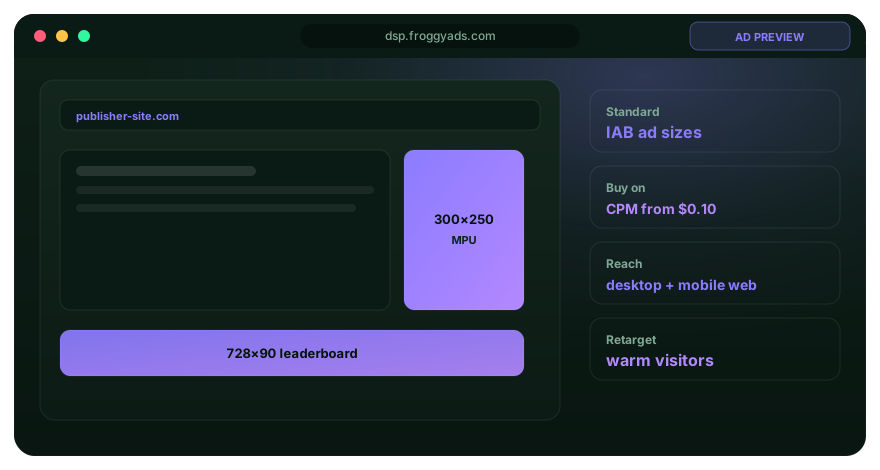
7. Make the action honest and visually distinct
Use an action that describes the destination accurately. View the product, request a quote and start a trial create different expectations. A generic action is sometimes appropriate, but it should not hide an important commitment. When the next page asks for a sales appointment rather than providing an immediate demonstration, design the invitation around that actual next step.
A button drawn inside an image is a visual cue; the ad's implementation determines the real clickable area. Do not make a banner look like an operating-system warning, a message notification or an unrelated download control. Distinguish the advertisement from nearby navigation, and inspect the complete served placement when that preview is available. The goal is a deliberate response to the offer, not a click produced by confusion.
Keep the destination's first screen aligned with the banner. In the lunch-box exercise, the visitor should find the same product and the divider information promptly, rather than an unrelated category page. Use our landing-page guidance to review that handoff. FroggyAds can deliver the approved traffic test; the receiving page needs to make the advertised action straightforward.
8. Adapt the composition instead of stretching the artwork
Treat wide, tall and compact placements as different compositions of the same offer. A wide banner may place the product beside a short line of text; a tall version may build the reading order vertically. A compact mobile version may need fewer decorative elements. Preserve the product identity and the supported proposition, not the exact position of every object in the original layout.
Start the adaptation with the most restrictive required placement. It exposes a message that depends on too much copy or a product photograph that only makes sense when large. Once that constraint is understood, build the other layouts deliberately. A bigger canvas is useful for a clearer demonstration or better spacing, not permission to introduce unrelated benefits and additional actions.
Review each export independently even when the design tool resizes it automatically. Watch for stretched logos, changed line breaks, clipped qualifiers and product crops that remove important information. Record the approved version for each accepted size. A passing desktop export does not approve the mobile version, and a banner dimension listed by one platform does not establish available inventory for another campaign.
9. Give animation a communication job
Use motion when it explains something a static frame cannot show as clearly. The lunch-box concept might demonstrate the divider being removed, provided the depiction remains accurate. Motion that merely shakes a headline or repeatedly flashes an action can distract from the product and create an uncomfortable experience. A useful sequence should still make sense when viewed briefly or when the viewer misses its beginning.
Make the important message understandable without depending on repeated playback. Keep the product, required condition and next action compatible across frames. Review the applicable animation, duration, file and flashing requirements for the actual upload; do not import a limit from a different network. Where motion adds little explanatory value, a static version is often the simpler asset to produce, review and compare.
Prepare the fallback required by the selected delivery method and inspect what it communicates on its own. A first frame that only says wait is a poor introduction if the sequence does not play. Archive the actual exported animation alongside the editable file so reviewers can check timing and transitions rather than assuming the application preview matches the delivered asset.
Use the next campaign to answer one design question
Test a supported message or visual change with FroggyAds. Preserve the approved control and compare useful customer actions before expanding the production brief or media allocation.
Create My Free Account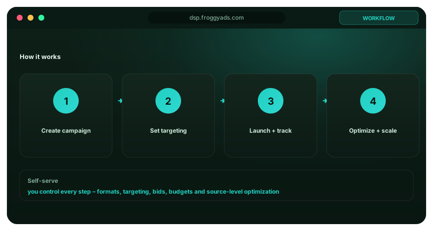
10. Hand off an export the media buyer can identify
Our published Display guide lists JPG, PNG, GIF and HTML5 creative types, with static and animated options. Confirm the accepted format, dimensions and current file limits in the intended FroggyAds campaign before producing the final family. Export quality, file type and upload acceptance are separate questions. A sharp image in the designer's viewer may still have the wrong dimensions or delivery format.
Open the exported file independently and check the product, text, crop and background. For a coded creative, also review the permitted click implementation, external dependencies and fallback according to the receiving platform's specification. Do not assume that supplying an HTML5 file gives permission to execute arbitrary scripts or collect visitor information. Keep technical implementation inside the requirements of the selected campaign.
Use a clear filename and a release record linking the export to its message, size, language and destination. A checksum can help confirm that the uploaded file is the approved one, but it does not establish that the offer is correct. The handoff should let a buyer locate the right asset without opening every file called final, and let the designer find the editable source when a genuine revision is needed.
11. Launch the design as an identifiable FroggyAds test
Create your FroggyAds account, select the eligible Display setup and bring the reviewed creative with its destination. Choose the relevant location and device settings, set a campaign budget and check the available source controls. Keep the first comparison narrow enough to understand. Testing a new image while also replacing the offer, destination and audience makes the design's contribution difficult to interpret.
Separate account funding, creative production and campaign spending. A minimum deposit funds the account; it is not an estimate of what your design needs to prove itself. A starting CPM bid is a rate for impressions, not a price per customer. Choose your test allocation from the information you need, the campaign's delivery conditions and the cost you can supervise, then review actual spend against accepted enquiries or purchases.
Use conversion tracking and your business records to connect the asset with the action that matters. Confirm the destination and measurement route before submission, using authorised test data. A review of a local design file is not a successful live campaign test. After approval and delivery, retain the asset identity with the source and device evidence you use for the next buying decision.
12. Turn design feedback into a specific revision
Separate a comprehension problem from a delivery or destination problem. If visitors repeatedly ask whether an accessory is included, inspect the image and wording that created that expectation. If the product page fails to load, repair the page before rewriting the headline. If one source behaves differently from the rest, investigate its context rather than assuming every export needs a new colour scheme.
A useful feedback note identifies the asset version, the observed problem and the proposed change. For example: the divider is hidden in the narrow crop; replace that crop while retaining the approved message. This gives the designer a testable revision. Make it pop does not. Keep the prior approved version so the team can tell whether the actual change addressed the problem.
Review qualified customer actions beside initial response. More clicks may mean clearer communication, broader curiosity or a misleading cue; the click total alone does not tell you which. Our campaign optimisation workflow helps you connect creative decisions with source and spending decisions. Expand a design because the evidence supports the next step, not because a larger response number looks encouraging in isolation.
Plan the work behind a dependable banner
Budget for product clarification, copy, design, image rights, adaptations, export checks and destination review as well as media. Reusing an approved concept can reduce production work, but a new offer or language still needs review. Ask a designer or agency which source files, exports and revisions are included, and who will resolve an upload rejection. That scope is more useful than choosing purely by the promised number of banners.
Treat templates as a starting structure, not an approval of the message placed inside them. Adobe Express and Canva describe template-based banner creation and customisation. Neither a template nor a resize command verifies your product claim or FroggyAds campaign acceptance. Keep the final customer-facing decision with the people who understand the offer and the placement.
Frequently asked questions
What information belongs in a banner design brief?
Include the campaign job, audience, product, approved claim, material conditions, destination, sizes, platform limits, market, deadline and reviewer. A complete brief reduces late edits that can break message or evidence.
How should layout grids adapt across banner sizes?
Create size-specific grids that preserve message hierarchy, safe areas and image focus rather than shrinking one wide layout mechanically. Review every final export at actual scale and in a representative placement.
What should guide banner typography at small sizes?
Use a readable typeface, adequate character size, contrast and line length for the final rendered unit, with concise approved copy. Avoid reducing material terms until they technically fit but no longer remain legible.
How should a brand system govern banner design?
Use approved colours, typography, logo rules, imagery and tone while allowing the hierarchy needed for the campaign's message. Document any exception and test it with the brand owner before production expands.
Which image rights should banner designers record?
Record the image source, licence, permitted media, geography, term, modifications and any required attribution beside the asset. Retire exports when the licence or campaign scope no longer permits use.
What belongs inside a responsive banner safe area?
Keep the product identity, core claim and any material qualifier within areas that survive common crops and template changes. Preview platform combinations because safe space depends on actual responsive behaviour.
How should an animated banner sequence information?
Ensure each frame advances one understandable idea and the final frame contains the complete offer and action without relying on replay. Test timing, motion sensitivity and platform fallback before approval.
What should a banner export checklist verify?
Verify dimensions, file type, weight, colour, text rendering, image crop, animation, click destination, stable filename and checksum. Open the exported file independently rather than trusting the design application's preview.
How should teams give useful banner design feedback?
Tie feedback to the campaign job, hierarchy, claim, readability, platform constraint or customer route, and identify the affected version. Avoid subjective requests that add decoration without explaining the decision they improve.
What should be archived with final banner designs?
Archive editable source files, linked assets, fonts or licences, approved exports, copy, review evidence, dimensions and active dates. A complete archive supports correction without recreating an uncertain version.
Creative, format and review references
Google documentation describes Google-specific creative methods, not identical FroggyAds functionality. W3C supplies accessibility guidance and the FTC material is a U.S. advertising reference. Review the requirements of your actual offer and placement; these references do not certify the fictional teaching brief or a live campaign.
Launch your reviewed Display creative with FroggyAds
Bring the approved offer, accepted creative and matching destination. Set your relevant targeting and campaign budget, then use source evidence and suitable customer actions to guide the next test.
Create My Free AccountChoose FroggyAds to put the approved design to work
Build the banner around the customer decision: an identifiable product, a defensible benefit and a destination that delivers the promised next step. Keep the exported file readable and the campaign version traceable. That combination gives the media buyer something more useful than an attractive image with an uncertain offer.
With FroggyAds, you can take that reviewed creative into a self-serve Display test and retain control over targeting, budget and traffic sources. Use the results to decide what to keep, clarify or redesign. Start with the strongest supported invitation you can make, then let actual customer behaviour guide the next campaign.
Banner design: the final production check
Quick answer: Approve the offer and hierarchy first, inspect each export at served size, and verify the destination before buying traffic. Use FroggyAds Display controls to connect the approved asset with a defined audience, spending limit and measurable customer action.
Format reference: Google Ads creative specifications. Confirm the requirements of the platform and format you will actually use.
Keep these boundaries in the release
- The lunch-box brief is fictional; its layout critique is not a measured campaign result.
- A resize, contrast check or successful upload does not approve every aspect of the customer journey.
- Retain the exact creative version when deciding what to redesign or scale.
What should you have ready before uploading a banner?
Have the accepted creative file, verified offer, relevant destination and a clear test objective ready together. Review the actual export rather than only the artboard. FroggyAds provides the campaign controls to distribute the banner; your approved product evidence and customer-action records make its response meaningful.