
Popunder Ads Examples: A Practical Execution Playbook
For Popunder traffic, the landing page is the main creative. Our software and ecommerce examples show how to identify the advertiser, explain a genuine offer and provide a clear next step when a visitor arrives without search-query context. Use FroggyAds source controls to compare the destinations by useful customer outcomes, not visit volume alone.

| Example decision | What to test |
|---|---|
| Qualify the offer | State eligibility and material conditions on the destination, then observe which actions the business accepts. |
| Explain the product visually | Use genuine authorized product imagery to answer a customer question on the first screen. |
| Compare accepted outcomes | Retain destination versions and comparable spend; separate raw actions from accepted customers. |
Reference for Popunder Ads Examples Guide: Coalition for Better Ads Standards.
What should a useful popunder example show?
Use an example to inspect the destination's first screen, advertiser identity, offer and action. Browser settings and supply affect opening behavior, so the popunder label does not guarantee one behind-window experience. Our Popunder Ads Examples Guide focuses on what you can prepare: a destination that makes sense to an unfamiliar visitor.
Treat an example as a hypothesis about customer understanding. Record which problem it explains, which eligibility condition it makes visible and what the customer should do next. A product image or headline copied without those decisions tells you little about the original campaign's accepted outcomes.
Keep the concept separate from its buying conditions. The same landing page can receive different markets, devices or source mixes. Retain the destination version with the actual purchase and review period so a changed audience is not mistakenly credited to a new page layout.
Choose FroggyAds for a destination-first test whose targeting, budget and source decisions you can control. Your offer determines the acceptance rule; our buying controls help you investigate the response under defined conditions. An attractive example remains a starting point until your own evidence supports further spending.
Six controls for an example-based landing-page test
Use these controls to turn a visual reference into your own truthful destination brief. Each control should affect a visitor decision or make the resulting campaign easier to evaluate.
Lead with one promise
Lead with one useful promise on the destination. Explain the real benefit after arrival instead of assuming the visitor has seen a preceding banner or search query. Keep important qualifications near the action so curiosity is not mistaken for a suitable customer request.
Add qualifying context
Add the conditions that determine whether the offer is usable, such as supported systems or delivery availability. Treat qualification as a test hypothesis: clearer conditions may change both response volume and acceptance. Measure the actual result rather than promising a lower acquisition cost.
Make the visual useful
Use a genuine product view, interface or comparison image to answer a question. The visual should help a visitor recognize the product or understand a difference. Avoid decorative screenshots that imply an endorsement, result or feature the offer cannot substantiate.
Carry the offer through the action
Carry the same product, material terms and requested action from the first screen through the form, product selection or checkout. If an intermediary page is used, give it a useful explanatory job and preserve the supported measurement route.
Label every concept
Label the concept and destination version together. Record the headline, visual, qualification and action being tested, plus the date and buying conditions. A clear version record helps you reproduce a useful concept without assuming that another source or market will respond identically.
Judge downstream value
Judge accepted outcomes separately from intermediate response. Click-through rate describes recorded clicks relative to measured ad impressions in a defined context; it does not establish accepted customer value. For a Pop purchase, retain the actual charged unit and observed landing events before choosing the denominator for a comparison.

Test one destination question with our buying controls
Start an example-based Pop campaign with FroggyAds
Create your free FroggyAds account when your offer permits Pop traffic and the destination is ready. Set a limited purchase, label the page version and compare the accepted outcome your business actually values.
Create My Free Account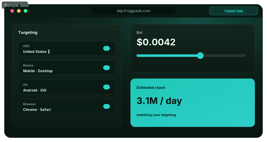
Prepare a first screen that explains the offer
Use the selected campaign's destination requirements rather than a universal banner-size assumption. Check the first screen, readable text, stable layout and intended action on the relevant devices. Record the actual destination URL and version before comparing its response with another concept.
An unfamiliar visitor needs enough context to decide whether the product is relevant. A clear description and visible conditions can be more useful than a dramatic headline that creates the wrong expectation. Examine accepted outcomes alongside raw actions when deciding which message deserves another purchase.
Write a short first-screen brief: who provides the offer, what the product does, who can use it and what action follows. Use the software and luggage concepts below as illustrations. The actual product details, prices, availability and authorized imagery must come from your own offer.
| Brief component | Question for the visitor | Evidence for the advertiser |
|---|---|---|
| Identity | Who provides this product or service? | Real advertiser identity and contact route |
| Promise | Which useful problem does the offer address? | A claim supported by actual product information |
| Visual explanation | What does the product or interface look like? | Authorized imagery matching the current offer |
| Eligibility | Can I use or receive this offer? | Current compatibility, availability and material terms |
| Action | What will happen when I continue? | A working feature, comparison, form or purchase route |
| Measurement | Which resulting action does the business accept? | A defined accepted event and comparable review window |
Choose the format for the explanation you need
Use our format choice to support the destination
Pop places the explanation on the destination. Push, Native and Display need their own creative treatment. Choose FroggyAds to test an appropriate presentation while keeping each format's buying unit, offer and accepted-outcome rule identifiable.
Create My Free Account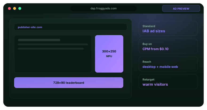
A seven-step process for comparing landing-page examples
Move from a customer question to a versioned destination and a bounded comparison. Each step should leave a usable record, rather than a claim that the example has already produced results.
Write the accepted outcome
Define the accepted event and its maturity rule before designing the example. A download click, trial activation and paid order are different events. Choose the one relevant to the offer, and retain intermediate actions as diagnostics.
Map the format role
Map what the destination must explain without assuming preceding search context. State the offer, material conditions and next action. Browser and supply behavior can differ, so the concept should remain understandable when the first usable interaction is on the destination itself.
Prepare the control
Prepare one control destination with an authorized visual and truthful message. Record its URL, version, offer terms and supported measurement parameters. Make a proposed variation answer one useful question, such as whether an explicit compatibility line improves the suitability of software enquiries.
Validate rendering and tracking
Check the destination and intended action on relevant devices, including any handoff to a form, product page or checkout. Verify the event route and available identifiers. Keep unverified tracking or device limitations visible before deciding that another page version is ready to compare.
Launch with limits
Launch the defined comparison within its media boundary. Retain the offer, targeting and acceptance rule while changing the selected page element. Record how traffic was assigned and any delivery differences; a version label alone does not establish a fair experiment.
Review mature evidence
Review comparable spend, usable arrivals, raw actions and accepted outcomes after the validation period. Keep pending and rejected events distinguishable. Check attribution and delivery differences before deciding whether a concept's observed acceptance justifies another purchase.
Expand one lever
Expand the element supported by the evidence. Preserve the prior version and inspect the next allocation separately. A larger purchase may change the source mix or customer conditions, so the first comparison cannot fix future performance.
Compare the concept and accepted outcome at the same scope
Keep the offer and acceptance rule constant when comparing a headline, visual or qualification change. Record how the visitors reached each version. If several conditions changed, describe the result as a broader comparison rather than assigning the difference to one unisolated page element.
Distinguish billed delivery, observed loaded visits, intermediate actions and accepted events. Each stage answers a different question. A feature-button click can indicate interest without proving activation, just as an add-to-cart action does not establish a completed, non-cancelled purchase.
Use campaign and source evidence where the actual tracking connection supports it. Mark unknown attribution and unresolved events openly. The useful conclusion may be that a route needs repair, rather than that the page with the largest raw response should receive the next allocation.
Three hypothetical Pop destination concepts
These concepts illustrate preparation choices, with no tested campaign or promised result. Replace the product details with verified information from your own permitted offer. Keep the decision being tested clear when adapting an example to another market or device.
Example one: a backup-tool feature page
A hypothetical backup tool could lead with 'Back up the folders you choose', a genuine authorized interface view and a 'View features' action. Show the supported operating systems and material purchase or trial conditions. Test whether the first screen helps an eligible visitor understand the product; never imitate a malware alert or initiate an unwanted download.
Example two: a cabin-bag comparison
An illustrative luggage destination could show a defined bag range, accurate product dimensions and a 'Compare cabin bags' action. Let the comparison explain real differences instead of suggesting universal airline approval. State availability, price and delivery conditions from the actual offer before asking the visitor to buy.
Example three: a localized product destination
Adapt the luggage concept to a market only when the product can actually be supplied there. Use the appropriate language, currency and verified delivery terms. Retain the concept family and local version so a translation or availability change is not confused with a newly proven creative pattern.
Bring a truthful concept to a controlled purchase
Choose FroggyAds for destination-first example testing
Use our targeting, budget and source controls to make the next test manageable. Bring an eligible offer, a clearly identified destination version and a working event route. Compare customer outcomes before buying additional reach.
Create My Free Account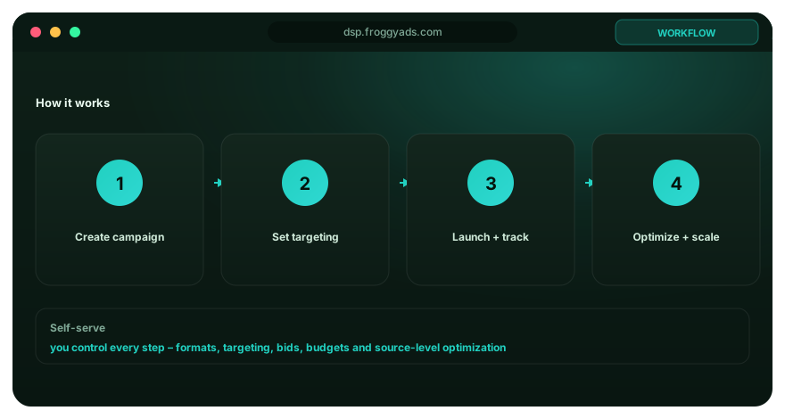
Set a media boundary for the concept comparison
Confirm the charged unit in the actual Pop campaign before comparing cost. Keep media spend, billed visits and observed arrivals separate. Our published entry bid is a starting buying figure; it does not establish the cost of an accepted customer or the amount needed to validate a concept.
Authorize a learning allocation the business can afford and write the question it should answer. Keep any later confirmation or expansion identifiable. The available account balance is separate from the amount committed to this particular destination comparison.
When the result weakens, locate the unresolved stage. Check arrival and the working action before attributing the problem to the visual concept. Repair a documented failure and run a limited confirmation instead of changing the bid, offer and destination together.
Check the concept and action before releasing spend
Give the launch owner a record of each preparation check and any remaining limitation. Verify the concept, device route and event connection before releasing the comparison allocation.
Define the accepted outcome and review window before releasing the comparison allocation.
Assign a concept and destination version that identifies the actual message, visual and next action.
Check the first screen, layout and intended action on relevant devices; record problems that remain unresolved.
Verify the event route and supported identifiers, retaining duplicate, missing and uncertain records transparently.
Set a spending boundary, available frequency control and a reason to pause or revert the purchase.
Require accepted-outcome evidence and a working destination before authorizing a larger allocation.

Keep the example truthful and usable
Identify the advertiser, use accurate benefits and make material conditions visible. Avoid false security warnings, fabricated urgency or private-message imitations. The customer should understand the offer without being tricked into the next action.
Check the actual destination experience on the intended devices. Product details, controls and forms should remain understandable as the viewport changes. A mobile visitor should be able to inspect the offer and choose the next step without a misleading close control or forced sequence.
Retain complaints, cancellation or rejection reasons and observed route problems with the concept record. Investigate what they show before classifying the cause. An unhappy visitor or missing event may point to a page, offer or measurement problem that a cheaper visit cannot repair.
Test your destination through our self-serve buying workflow
FroggyAds gives you targeting, budget and source decisions for a defined Pop purchase. Confirm the live inventory and destination requirements before launch. Our wider network figures describe supply across the platform; they do not guarantee inventory or accepted outcomes for one example.
Use our source-level controls to investigate supported differences between destination versions.
Retain the offer and event rule when deciding whether the next allocation should confirm, repair or expand the concept.
Our format choice lets you compare a suitable presentation while keeping the creative work and buying unit of each format distinct.
Reference standards
- Coalition for Better Ads Standards: User-experience framework for interruptive web advertising
- Web Vitals: Landing-page loading, stability and responsiveness framework
- MRC Standards: Invalid-traffic and measurement reference standards
Popunder Ads Examples FAQ
Practical answers for advertisers preparing truthful examples, comparing destination versions and reviewing accepted outcomes.
What does a popunder ad example show if there is no banner?
The main creative is the destination’s first screen: show the advertiser, a real offer, material conditions and a deliberate next action. A useful software example explains compatible use; an ecommerce example helps compare actual products. FroggyAds Pop buying uses a landing URL, so prepare the page and evaluate its accepted outcomes through available campaign and source controls.
What is a practical software-offer popunder example?
For a hypothetical backup tool, the first screen could say 'Back up the folders you choose', show the genuine product interface and offer a 'View features' action. State supported operating systems and material purchase or trial terms. This is an illustrative concept, not a tested campaign. Do not turn the page into a false malware warning or start a download without a deliberate user action.
How could an ecommerce landing page work as a popunder creative?
An illustrative luggage page could open with a clear product range, actual bag dimensions and a 'Compare cabin bags' action. Show accurate availability, price and delivery information where they affect the choice. Keep the page useful to a visitor who arrives without the context of a search query. We recommend one understandable product decision rather than a crowded homepage that makes the visitor rediscover the offer.
Should a popunder example send traffic through a pre-landing page?
Use an extra page only when it adds useful, truthful context. A software comparison or explanation may justify that step, while a simple product offer may work better with a direct route. Test both paths against the same final conversion when the offer allows it. Preserve supported tracking parameters through redirects and do not judge the pre-lander only by its outbound click count.
Can I copy a successful popunder page from another advertiser?
Borrow the lesson, not the protected design, claims or customer evidence. Rebuild the concept around your own offer, authorized assets and current terms. A visible example rarely reveals the original traffic price, audience, conversion approvals or later refunds. Treat it as a hypothesis for your FroggyAds test, not as a ready-made page with a transferable profit guarantee.
What should a mobile popunder example make clear immediately?
Identify the advertiser, explain the offer and show a usable next step without relying on a desktop-sized layout. Check loading, text size, controls, forms and any destination handoff on the actual devices you target. Do not manufacture a button that looks like a browser close control. A user should be able to understand or leave the page without being trapped in an unwanted sequence.
Do I need code that forces a popunder to open for my visitors?
As an advertiser buying traffic, your main job is to supply an eligible destination and configure the campaign. The publisher's ad delivery is a separate part of the supply system. Do not add forced-window scripts or attempts to defeat browser controls to your landing page. Check the selected FroggyAds format and destination requirements, and ask support about an unclear delivery behavior rather than redesigning the publisher's implementation.
How do I compare two popunder landing-page examples?
Keep the offer, targeting and conversion definition stable, and label each destination version. Compare loaded visits, completed actions and accepted value by source, allowing for conversion delay. One page may attract more intermediate clicks while producing fewer qualified customers. Use our source controls to investigate the difference instead of letting a large volume of inexpensive visits determine which creative wins.
What should I investigate when a popunder example gets visits but no results?
Check that the page loads, the advertised offer is available, forms or payment steps work and the conversion event is recorded correctly. Then inspect source and device differences. Visitors may need clearer context, or the offer may not fit the traffic. A low visit price does not repair those problems; fix the smallest identified cause and test it separately before increasing spend.
How should I launch an example-based Pop test on FroggyAds?
Prepare a truthful, compatible landing page and verify that the offer accepts Pop traffic. Set the relevant market and device filters, a bid, frequency setting and campaign spending limit, then test tracking before review. Our published Pop entry bid and $50 account deposit are not guarantees of traffic volume or sales. Choose FroggyAds for destination-first testing with the source controls needed to act on real customer outcomes.
Continue with the next format decision
Use the related guides for destination specifications, execution repairs or cost planning when those become the next buying question.
Launch popunder ads with clear controls
Put the chosen concept into our self-serve workflow with the offer, destination version and event rule retained. Set an allocation you can inspect, then use the outcome record to choose confirmation, repair or expansion. Start your next campaign with FroggyAds.
Build a concept record before comparing the results
Give each destination concept a specific customer question before launch. Record the exact message, visual, conditions and action being compared. A screenshot does not reveal the original campaign's price, audience or eventual acceptance, so keep those unknowns distinguishable from your own test.
Keep landing-page speed checks with the intended device route and concept version. Use those checks to investigate arrival loss, while accepted customer outcomes determine the business decision. Repair an observed device or action failure before using the next purchase to judge a visual variation.
| Hypothetical observation | Destination A | Destination B |
|---|---|---|
| Media spend | USD 50 | USD 50 |
| Recorded raw actions | 18 actions | 13 actions |
| Accepted outcomes | 6 accepted | 9 accepted |
Example comparison: raw actions and accepted cost
Hypothetical destination A: assume the same offer, review window and USD 50 media allocation for each page, with 1,000 billed visits assigned to each version. A records 18 raw actions and six accepted outcomes, giving media-only accepted cost of USD 50 ÷ 6 = about USD 8.33. These inputs are illustrative, with other costs excluded; they are not FroggyAds rates or results.
A has more raw actions, but that fact alone does not decide the accepted-outcome comparison. Use your own complete records and disclose delivery or attribution differences. Create your free FroggyAds account. Keep unresolved outcomes pending and count each accepted event under the same business rule before authorizing the next purchase.
Read the accepted outcome before choosing the next page
Hypothetical destination B: at the same assumed USD 50 media spend, B records 13 raw actions and nine accepted outcomes. Its media-only accepted cost is USD 50 ÷ 9 = about USD 5.56. B has fewer raw actions and more accepted outcomes in this illustration. The small assumed comparison establishes no statistically proven winner, future result or profit; actual buying conditions and outcome quality still need review.
Choose an example you can explain and measure
Start with a permitted offer, an understandable destination and a useful comparison question. Choose FroggyAds to control the purchase, retain supported source evidence and review accepted outcomes. Expand the concept only when your own customer and cost records justify the next allocation.