
Call to Action: Definition, Placement and Measurement
A call to action, or CTA, tells someone what to do next: view a plan, check availability, request a quote or create an account. The best starting point is an action your destination can fulfil, expressed in words the visitor understands. With FroggyAds, connect that invitation to a targeted traffic campaign and evaluate completed customer actions, not button clicks alone.
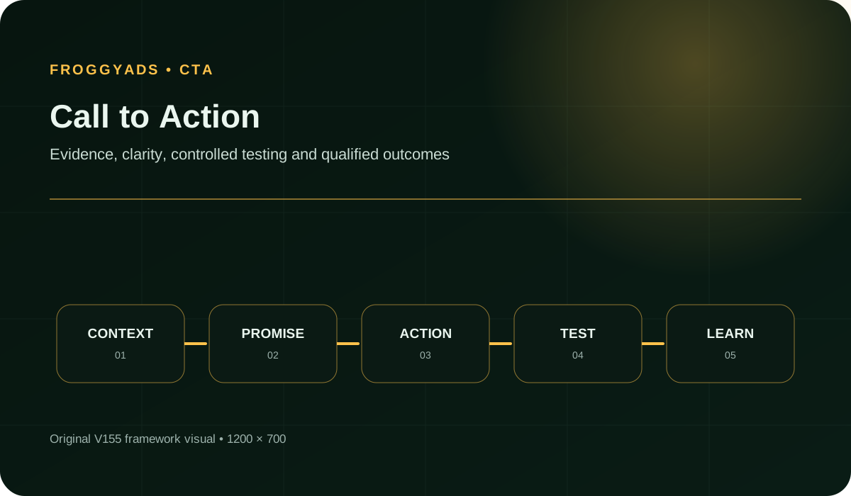
A CTA promises a next step, not an automatic result
A CTA can be a text link, a button, a short line in an ad or a spoken invitation. The defining feature is its direction: it asks the audience to take an identifiable action. On a campaign landing page, that action should continue the offer the advertisement introduced. Treat the label and the destination as one promise rather than polishing a button in isolation.
View plans means the visitor can inspect plans. Request a quote implies a request rather than an instant price. Create an account should not suggest that a paid campaign has already started. When the actual journey differs, explain the commitment before activation. A persuasive label is useful only when the next screen makes it true.
For FroggyAds advertisers, the first task is to identify the customer event that matters to your business. An affiliate offer may require a qualified lead, a store may require an order, and a SaaS team may require an activated account. Your CTA should invite the immediate step toward that event. It does not need to pretend that every click is already a sale.
Choose an action the visitor is ready to consider
Begin with what the page has established. A reader who understands the product and price may be ready to start checkout. Someone evaluating an unfamiliar service may need to inspect its scope or request a demonstration. Decide which useful next step your current content supports, then remove wording that skips an important decision without explaining it.
A lower-commitment action is not automatically better. A downloadable guide could attract people who have no need for your paid offer; a direct application could discourage suitable prospects when the requirements are unclear. Judge the invitation by the intended audience and business process, not a general rule that every funnel needs more stages or every page must immediately ask for a purchase.
Write down the promised destination, the information requested and the expected result. This compact action brief gives the designer, developer and media buyer the same understanding. Use our landing page guide for the wider page argument, and our ad copy guide to align the invitation with the message that brings the visitor there.
| Actual next step | A clear illustrative label |
|---|---|
| Show current plans and terms | View plans |
| Open available booking slots | Check available times |
| Send an enquiry for a tailored price | Request a quote |
| Open account registration | Create your account |
| Confirm the completed form is ready to send | Send your enquiry |
Write the action first and explain the commitment nearby
Use a verb and a recognisable object. The visitor should not need to decode an internal campaign name or a clever phrase to understand the control. Keep necessary context close: whether a demonstration is live or recorded, whether a form requests contact details, and whether an action starts a paid commitment. Do not make the button carry an entire paragraph, but do not hide important terms to make the label shorter.
For a fictional consultancy, Get your plan is misleading when the next screen only requests a callback and no plan is supplied. Request a planning call describes that journey more accurately. This is an editorial illustration, not a tested conversion improvement or a promise made by FroggyAds. The purpose is to show how a label can remove a specific expectation mismatch without adding a discount, deadline or invented benefit.
Avoid implying free access, immediate fulfilment or limited availability unless the offer supports it. The FTC's U.S. advertising guidance is one reference for truthful offers and material disclosures; requirements depend on the actual market. A more accurate CTA may attract fewer curious clicks while making the resulting enquiries easier to understand and serve.
Send the right audience to a clear next step
Create your free FroggyAds account and plan a campaign around the action your destination actually supports. Set the available targeting and campaign budget, then review customer response by source.
Create My Free Account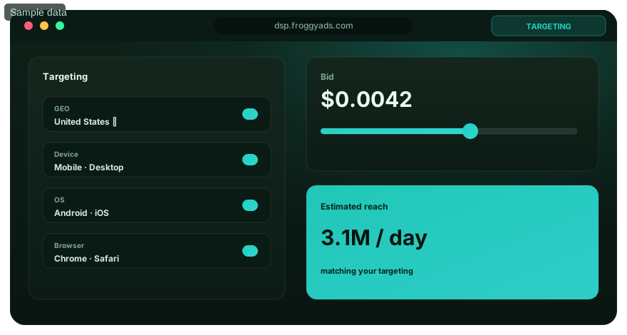
Give the page a primary action without removing useful navigation
Choose one principal customer decision for a campaign destination and give it a consistent visual treatment. Make genuinely different alternatives easier to distinguish. A pricing link, a product-details link and a signup invitation can all be useful, but they should not compete as three indistinguishable promises in the same small area. Supporting information should help someone choose, not disappear simply because a conversion target exists.
On a long page, repeating the same primary action after meaningful sections can save a ready visitor from scrolling back. Repetition is different from introducing unrelated offers at every interval. Keep the destination and commitment consistent, and record the position separately when you measure it. Do not turn navigation, required disclosures or consent choices into obstacles in order to make a marketing button seem more prominent.
The GOV.UK button guidance discourages competing primary buttons in its service-design context. Use that as a hierarchy principle, not a command to strip a commercial website's header or footer. On your own destination, review whether an interested visitor can identify the main action while retaining access to the information needed for an informed decision.
Match the visual control to what it actually does
A navigation link takes the user to another resource or location. A button performs an action such as submitting a form or opening a dialog. They can share a visual style, but their underlying behaviour should match their role. A link to an account-registration page need not become a scripted button just because it looks prominent; a form submission should not depend on an empty link that behaves unpredictably.
Use native HTML controls when they meet the need. A real submit button participates in form behaviour, while an anchor with a real destination supports ordinary navigation. Specify the button type deliberately inside a form so a help or preview control does not accidentally submit it. The W3C button pattern describes expected roles and keyboard interactions; visual resemblance alone does not implement them.
Check the actual exported page, not only a design mockup. A control can appear correct while lacking a working destination, keyboard operation or meaningful name. Conversely, adding custom scripting to a working link can introduce an unnecessary dependency. Treat implementation as part of the promised action and keep the simplest behaviour that correctly serves the visitor.
Make the CTA understandable with a keyboard, touch or assistive technology
Check that the visible label is represented in the control's accessible name. A button visibly labelled Request a quote should not be exposed as an unrelated internal label such as Lead capture variant B. The W3C Label in Name guidance explains that relationship. Put internal experiment identifiers in your measurement record, not in wording that changes what assistive-technology users understand.
WCAG 2.2's Target Size (Minimum) criterion uses 24 by 24 CSS pixels, with exceptions for spacing, equivalent controls, inline targets, user-agent controls and essential presentation. It is not a blanket rule that every control at that size is comfortable or that a large button makes the page accessible. Review the actual active area, spacing and context rather than the dimensions of a decorative icon.
Try the journey using keyboard focus and ordinary activation, and check that focus remains visible. On mobile, inspect whether sticky elements, an on-screen keyboard or a consent panel covers the next action or its explanation. Zoom and longer translated labels can expose wrapping problems. These checks support a usable CTA, but they do not by themselves establish complete accessibility conformance or replace testing with the people who use the interface.
Treat submission as a sequence of states
A form CTA has more than an idle and a success state. Before submission, the visitor may need to correct a missing field. While a request is pending, the interface should acknowledge progress and avoid treating repeated activation as a fresh customer intention. After a rejection or network problem, explain what remains unresolved and provide an appropriate route to retry. Show confirmation only when the relevant response justifies it.
The frontend and receiving system need compatible rules for repeated requests. Disabling a visible button can reduce repeated activation in that interface; it does not establish that the server will never receive a duplicate. Coordinate stable submission identifiers and the receiving system's duplicate-handling behaviour where supported. Do not invent a platform guarantee or hide a failed request simply because the button displayed a spinner.
Keep these states separate in your measurement. An attempted activation, a valid form submission and an accepted lead describe different events. If the same success screen renders twice, your reporting should not automatically count two customers. Work with the actual tracker and backend implementation to decide what is authoritative, which identifiers are permitted and how rejected or duplicate records will be reconciled.
Test the destination before you increase traffic
Check the real form, confirmation and tracking for your offer before the next allocation. FroggyAds puts the traffic controls in your hands; your destination should make the promised action clear and dependable.
Create My Free Account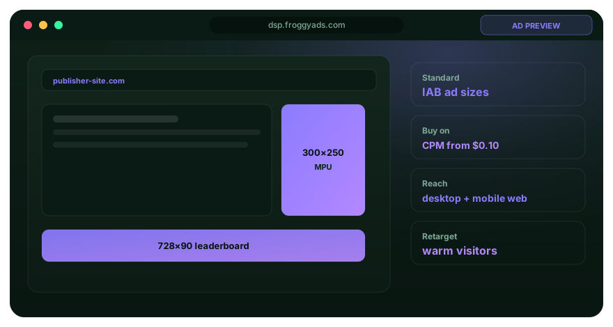
A local acceptance exercise for a fictional enquiry form
This guide uses an isolated test fixture, not the FroggyAds signup application or a live customer form. Its required email field, submit control and simulated responses are designed to expose the difference between activation, a pending request and acceptance. No network request, account creation, email delivery or real customer record is involved. The exercise checks only the behaviour deliberately implemented in that fixture.
The expected sequence is specific: an empty required field prevents a submission; a valid submission creates one pending request; repeat activation while pending creates no additional request; a simulated rejection permits retry; and a simulated accepted response records the fictional request once. Keyboard activation is checked separately. Repeating an acceptance response with the same fixture identifier must not create another accepted event.
| Fixture check | Meaning of the result |
|---|---|
| Empty required field | A click is not a valid submission. |
| Valid submission enters pending state | The request exists, but acceptance is not yet established. |
| Repeated activation while pending | The fixture must not create an additional request. |
| Simulated rejection and retry | An error must not be labelled success; the user retains a correction path. |
| Keyboard activation | The control is not limited to pointer input. |
| Repeated simulated acceptance identifier | The local event record counts that identifier only once. |
Use the exercise to brief your own acceptance tests, not as proof that your production form has passed them. A real implementation also needs server-side validation, genuine error responses, privacy review, network testing and an appropriate accessibility assessment. Keep synthetic test activity separate from business reporting, and never improve a campaign dashboard by feeding it these fictional events.
Measure a funnel with named populations, not one vague CTA rate
Decide what counts as an opportunity to see the CTA. Page visits are not always observed CTA exposures: a lower-page control may never enter the viewport. An exposure event also needs a declared visibility rule and an eligible measurement population. Where observation is unavailable, report that limitation instead of treating every visit as a confirmed view. Do not confuse landing-page CTA exposure with an advertising impression.
Give the primary action a stable identifier and record position and version separately. A repeated primary CTA near the top and bottom may lead to the same form but have different exposure opportunities. Count unique sessions or events consistently within each reported rate; repeated clicks from one visitor should not silently become several independent people. Keep approved data collection and consent conditions visible when interpreting missing records.
Follow the transition to the business outcome: observed opportunity, activation, form start, valid submission and accepted enquiry or order. Join records only where your identifiers and observation window support it. Keep raw event counts and deduplicated business totals distinguishable. Our conversion rate guide helps frame the denominator, while FroggyAds campaign and source reports supply the traffic-buying context.
Worked numbers: a higher click rate need not improve accepted cost
Hypothetical comparison, not customer results or a recommended spend: A and B each have 1,000 eligible sessions with a recorded CTA exposure under the same assumed rule. A records 150 activations, 90 form starts, 40 submissions and 30 accepted enquiries for USD 150 in media spend. B records 120 activations, 100 form starts, 48 submissions and 36 accepted enquiries for USD 180.
Activation divided by exposed sessions is 15% for A and 12% for B. Accepted enquiries divided by those sessions are 3% and 3.6%. Accepted enquiries divided by activations are 20% and 30%. Yet media cost per accepted enquiry is USD 5 in both cases. Picking A from its click rate or B from its accepted total alone would miss part of the buying decision.
The arithmetic does not establish statistical significance, a causal effect from the label or equal customer value. The groups may have different sources, timing or audience mix; their total spend also differs. State those limitations and consider later customer value and operational cost before allocating more. A useful report explains what changed, how the numbers were defined and which conclusion the evidence can actually support.
Choose your next traffic allocation from completed outcomes
Keep CTA exposure, activation and accepted customer events separate. Combine your destination evidence with FroggyAds source reporting so a higher click total does not conceal a weaker business result.
Create My Free Account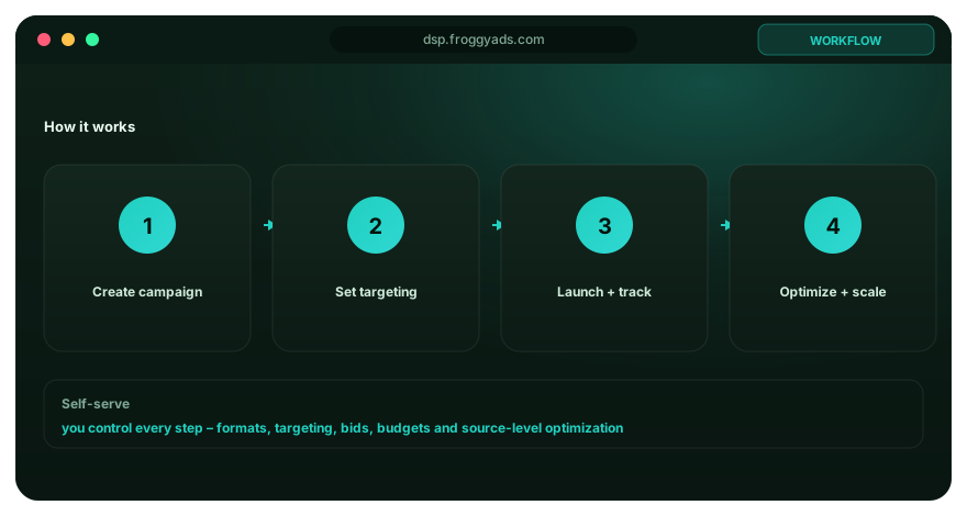
Diagnose where the customer journey stops
Separate attention problems from completion problems. When the CTA was rarely observed, first inspect placement and the content leading to it. When it was observed but seldom activated, investigate clarity, offer fit and commitment. When activation is healthy but the form does not start, examine the destination route. Each situation asks a different question; changing a colour is not a general repair for all of them.
| Signal to investigate | Next practical check |
|---|---|
| CTA receives little observed exposure | Check content position, loading, overlays and whether exposure measurement is available. |
| Many activations, few form starts | Inspect redirects, access requirements and whether the next screen matches the label. |
| Form starts but repeated errors | Test required fields, clear error messages, mobile input and the receiving response. |
| Submissions but few accepted leads | Review qualification, duplicate rules and source quality before declaring the CTA successful. |
| A reported lift after several changes | Separate label, layout, offer and traffic changes; the improvement may not belong to the button. |
Do not classify every short visit or missing event as bad traffic. A consent choice, blocked measurement or navigation interruption can change observability. Keep unknown outcomes unknown until there is evidence to explain them. Use your findings to improve the actual journey and then review campaign allocation through our optimisation workflow.
Run a focused CTA test with FroggyAds traffic
Choose FroggyAds when you have a destination worth testing and want to control the traffic entering it. Our self-serve platform provides supported formats, targeting, bids, campaign budgets and source reporting. Keep the tested page and customer-action definition connected to those campaign records. You can then distinguish a change in the destination from a change in who reached it.
State the comparison before launch. Changing Request a quote to Get a price while preserving the same enquiry form asks whether the second label creates an inaccurate expectation as well as whether it attracts more response. Changing the form itself at the same time tests a broader journey. Use appropriate controlled assignment when available; otherwise describe the result as an observed comparison and retain the differing conditions.
Your website, testing tool and backend own the form behaviour and acceptance rules. This guide does not claim that FroggyAds supplies a landing-page experiment engine, server-side deduplication or an approval workflow. We supply the media-buying controls that let you manage the campaign around that implementation. Confirm tracking before committing the next allocation, and keep test events out of actual sales or lead totals.
Plan the work behind a small button change
The visible change may be a few words, but the release can affect design, translations, accessible names, analytics labels, redirects, screenshots, form states and support instructions. Identify which dependencies actually change. Do not rebuild the whole page for a simple clarification, but do not assume the live behaviour is correct because the wording looks better in a document.
Keep creative and implementation costs separate from media spend. Decide the question the next traffic allocation should answer, the time needed for accepted outcomes to arrive and the limit you will use to pause an unhelpful test. Account funding is not the same as a test budget. There is no universal spend that guarantees enough data for every offer, source and conversion rate.
Our CTA examples can help you explore wording patterns; this guide provides the implementation and measurement questions behind them. Select one defensible invitation, test the complete route and preserve the version that ran. Use FroggyAds to reach the relevant audience, then make the next change from the customer journey you can document rather than from a more colourful button alone.
Frequently asked questions
What job does a call to action do on a marketing page?
A call to action gives an interested visitor a specific, low-friction next move. Write it as a clear action, place it beside the information needed to decide, and say what the next screen or contact will involve. The surrounding page must earn the click; a bold button cannot replace a credible offer.
How do I choose the right action for a visitor?
Match the action to the decision the page supports. Someone comparing options may want to view plans, while a ready buyer may be comfortable starting checkout. Asking for a large commitment too early can hide interest that a smaller, useful step would reveal.
Which words make a CTA easy to understand?
Use a specific verb and the object of the action, such as “Download the guide” or “Check availability.” Keep the label consistent with the destination. Avoid clever wording when it makes the visitor pause to work out what the control will do.
Where can a CTA appear without disrupting the page?
Place the first CTA after the visitor has enough context to act, then repeat the same primary action at natural decision points on a long page. Keep supporting links visually secondary. Placement should follow the argument rather than interrupt it.
How should a primary CTA stand out visually?
Give it clear contrast, readable text, enough surrounding space, and a stable position in the layout. It should be obvious without making every other element disappear. Use one primary style consistently so visitors do not have to decode several competing buttons.
What makes a call-to-action control comfortable on mobile?
Give the control a comfortable touch area, concise label, clear focus treatment, and breathing room from other actions. Check tall and wide viewport layouts, zoom, screen readers, and on-screen keyboards; a fixed button must never obstruct reading or consent.
When do multiple CTAs create decision friction?
Friction grows when several controls look equally important but lead to unrelated outcomes. Choose the page's primary action and make alternatives clearly secondary. Repeated buttons are fine when they continue the same decision instead of reopening it.
What should visitors know before a CTA opens a form?
Tell them the purpose of the form, the information it requests, and what happens after submission. If a call, account, or payment follows, say so before the click. Clear expectations reduce avoidable abandonment and make form results easier to interpret.
How can I measure a call to action properly?
Record when the CTA was visible and clicked, then follow the visitor to the completed business event. Review clicks, form starts, completion, and accepted leads or sales together. A button can attract curiosity without improving the final outcome.
What makes a CTA comparison useful?
Change one meaningful feature, keep the audience and destination stable, and decide the success event before the test starts. Let the comparison run under normal variation. The winning version should improve the downstream result, not merely collect more clicks.
Format and implementation references
The Google resources describe Google-specific creative requirements, the FTC resource covers U.S. advertising guidance, and W3C supplies accessibility standards. Read each within that scope. The fictional examples and local fixture in this guide do not establish platform approval, customer results or complete accessibility conformance.
Start with a clear customer action in FroggyAds
Bring your tested destination and a defined customer event. Choose the available targeting, set the campaign allocation and review accepted outcomes alongside source-level traffic evidence.
Create My Free AccountGive your next visitor a reason and a route to act
A dependable CTA combines a clear invitation, a suitable place in the argument, a working control and a destination that fulfils the promise. Design each part around the customer action, then measure the transitions separately. That gives you a practical basis for deciding whether the next improvement belongs in the wording, layout, form or traffic plan.
Choose FroggyAds for a traffic campaign you can configure and review directly. Bring the offer and destination, set a supervised campaign allocation and keep the final customer outcome connected to the source evidence. Start with one clear next step and build on what the completed journey actually shows.
Call to action: what to check before launch
Quick answer: Name the real next action, explain its commitment, use an appropriate accessible control and verify the destination. Measure exposure, activation, submission and acceptance separately. In FroggyAds, keep the campaign and source context alongside those outcomes before changing the next traffic allocation.
Format reference: Google Ads creative specifications. Confirm the rules used by the campaign you actually plan to run.
Before you publish
- A click or pending submission is not an accepted lead, sale or account.
- The visible label and accessible control name should describe the same action.
- Treat fictional fixture results and numerical examples as teaching evidence, not campaign performance.
What makes a CTA ready for paid traffic?
The invitation matches the offer, the control works through the intended input methods, and the destination handles completion and failure honestly. You can distinguish activation from the accepted business event. Launch the FroggyAds campaign with an identifiable page version, relevant targeting and a budget you can supervise.