
1. Define the placement
In an ad design program, define the placement before advancing. Document the hypothesis, responsible owner, input evidence, accepted output, deadline and stop condition so the decision can be reproduced.
Ad design arranges visual elements, copy and interaction so the audience can identify the message, understand the offer and recognize the intended action within the constraints of the format.
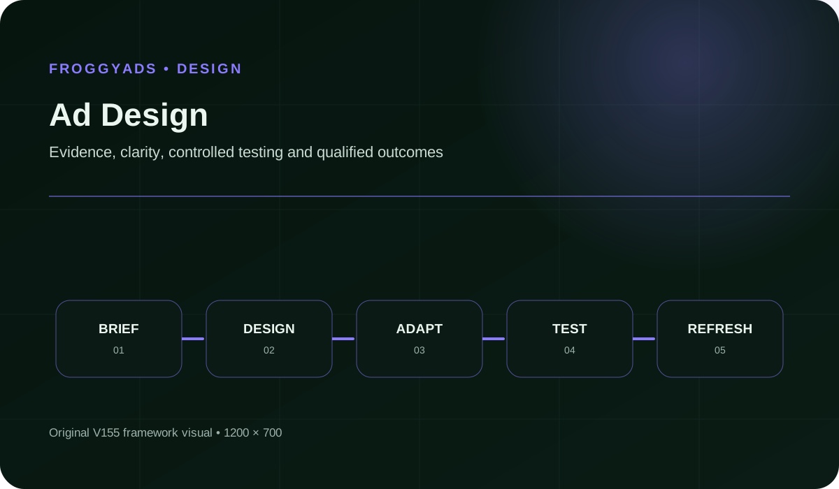
Quick answer: Ad design arranges visual elements, copy and interaction so the audience can identify the message, understand the offer and recognize the intended action within the constraints of the format. For designers and marketers producing performance-oriented advertising, the useful question is not simply whether a rate, click count or design score increased. The primary measure for ad design is qualified comprehension-to-action rate. Decorative Clutter can make ad design appear stronger while weakening truth, usability, conversion quality or economics.
Reference for Ad Design: Visual Hierarchy, Message and Performance: Google Ads: Specs, formats, sizes and best practices.
Ad design arranges visual elements, copy and interaction so the audience can identify the message, understand the offer and recognize the intended action within the constraints of the format. A practical definition of ad design also identifies the decision it supports, the eligible audience or denominator, the evidence source, the accountable owner and the point at which the outcome is mature enough to judge.
Separate production events from accepted outcomes when evaluating ad design. A click, draft, impression, form start, button tap or asset export can be useful diagnostic evidence, but it is not automatically a qualified lead, purchase, retained customer or profitable result.
Begin every ad design initiative with a boundary record. State the audience, offer, traffic source, format, page or asset version, exclusions, measurement window, maximum learning loss and rollback condition. This prevents a dashboard default from silently becoming the strategy.
Ad design matters because small changes in definitions, traffic quality, creative context or page experience can produce large apparent differences. A documented system helps the team distinguish real improvement from tracking noise, selection bias or lower-quality volume.
For designers and marketers producing performance-oriented advertising, the useful question is not simply whether a rate, click count or design score increased. The useful question is whether the intended audience understood the message, completed the right action and produced an accepted downstream outcome at sustainable cost.
The operational impact of ad design matters too. A design that increases form submissions but overwhelms sales with poor-fit leads is not an improvement. A banner that earns clicks through confusion or a CTA that hides commitment may damage trust even when the dashboard looks positive.
Use the choices established in “Why ad design matters” to define one audience, budget and source set in FroggyAds. Keep the surrounding offer and measurement rule stable so the test adds evidence to ad design instead of mixing several changes at once.
Create My Free Account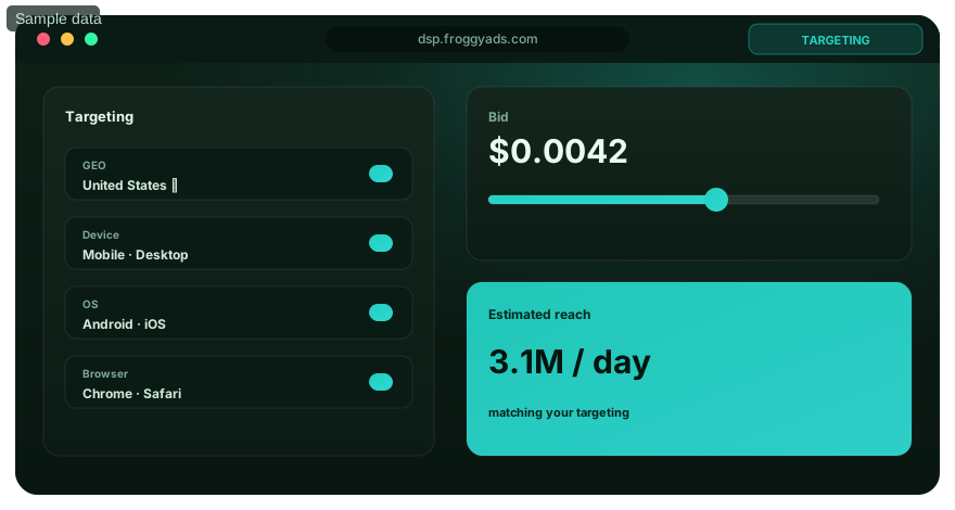
| # | Component | Operating requirement |
|---|---|---|
| 1 | Creative Objective | For ad design, record the owner, evidence source, acceptance rule, known limitation and failure condition for creative objective. |
| 2 | Placement Context | For ad design, record the owner, evidence source, acceptance rule, known limitation and failure condition for placement context. |
| 3 | Message Hierarchy | For ad design, record the owner, evidence source, acceptance rule, known limitation and failure condition for message hierarchy. |
| 4 | Visual System | For ad design, record the owner, evidence source, acceptance rule, known limitation and failure condition for visual system. |
| 5 | Copy And Cta | For ad design, record the owner, evidence source, acceptance rule, known limitation and failure condition for copy and CTA. |
| 6 | Technical Specification | For ad design, record the owner, evidence source, acceptance rule, known limitation and failure condition for technical specification. |
| 7 | Quality And Accessibility Review | For ad design, record the owner, evidence source, acceptance rule, known limitation and failure condition for quality and accessibility review. |
| 8 | Test And Version History | For ad design, record the owner, evidence source, acceptance rule, known limitation and failure condition for test and version history. |
For ad design, the interfaces between components are as important as the components themselves. Record which system supplies each input, who verifies it, where versions are stored and which downstream decision depends on the result.
In an ad design program, define the placement before advancing. Document the hypothesis, responsible owner, input evidence, accepted output, deadline and stop condition so the decision can be reproduced.
In an ad design program, write the creative brief before advancing. Document the hypothesis, responsible owner, input evidence, accepted output, deadline and stop condition so the decision can be reproduced.
In an ad design program, set hierarchy before advancing. Document the hypothesis, responsible owner, input evidence, accepted output, deadline and stop condition so the decision can be reproduced.
In an ad design program, build the master concept before advancing. Document the hypothesis, responsible owner, input evidence, accepted output, deadline and stop condition so the decision can be reproduced.
In an ad design program, adapt the formats before advancing. Document the hypothesis, responsible owner, input evidence, accepted output, deadline and stop condition so the decision can be reproduced.
In an ad design program, check technical delivery before advancing. Document the hypothesis, responsible owner, input evidence, accepted output, deadline and stop condition so the decision can be reproduced.
In an ad design program, review accessibility and rights before advancing. Document the hypothesis, responsible owner, input evidence, accepted output, deadline and stop condition so the decision can be reproduced.
In an ad design program, create test variants before advancing. Document the hypothesis, responsible owner, input evidence, accepted output, deadline and stop condition so the decision can be reproduced.
In an ad design program, measure qualified outcomes before advancing. Document the hypothesis, responsible owner, input evidence, accepted output, deadline and stop condition so the decision can be reproduced.
In an ad design program, refresh before fatigue before advancing. Document the hypothesis, responsible owner, input evidence, accepted output, deadline and stop condition so the decision can be reproduced.
Use the criteria around “A step-by-step workflow for ad design” to decide whether push, native, display or pop fits the message and destination. Set format, targeting and spend as campaign controls in FroggyAds while the ad design decision remains the standard for judging the result.
Create My Free Account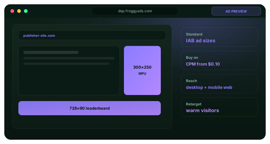
The primary measure for ad design is qualified comprehension-to-action rate. Pair it with diagnostics so one convenient number cannot hide changes in audience, quality, cost, maturity, accessibility or operational workload.
| Measure | Definition discipline | Review cadence |
|---|---|---|
| Qualified Comprehension-To-Action Rate | For ad design, define the numerator, denominator, eligibility rule, source, maturity window and owner for qualified comprehension-to-action rate before reporting it. | Daily for delivery checks; weekly or at maturity for decisions |
| Visual Attention | For ad design, define the numerator, denominator, eligibility rule, source, maturity window and owner for visual attention before reporting it. | Daily for delivery checks; weekly or at maturity for decisions |
| Message Recall | For ad design, define the numerator, denominator, eligibility rule, source, maturity window and owner for message recall before reporting it. | Daily for delivery checks; weekly or at maturity for decisions |
| Click Quality | For ad design, define the numerator, denominator, eligibility rule, source, maturity window and owner for click quality before reporting it. | Daily for delivery checks; weekly or at maturity for decisions |
| Conversion Lift | For ad design, define the numerator, denominator, eligibility rule, source, maturity window and owner for conversion lift before reporting it. | Daily for delivery checks; weekly or at maturity for decisions |
| Accessibility | For ad design, define the numerator, denominator, eligibility rule, source, maturity window and owner for accessibility before reporting it. | Daily for delivery checks; weekly or at maturity for decisions |
Reconcile ad-platform, analytics, CRM, ecommerce or product records before declaring success for ad design. Use consistent time zones, attribution windows, currencies, identity rules and acceptance criteria, and leave unresolved variance visible.
On Ad Design, use this control to keep the page's evidence and action traceable. A team creates one message hierarchy, adapts it to several placements and compares qualified outcomes rather than rewarding the unit with the highest raw CTR.
New visual and copy variants preserve the offer and audience so the test can isolate fatigue and creative contribution.
Designers export named, dimensioned, compressed assets with source files, rights records and landing destinations so media operations can launch without guessing.
Decorative Clutter can make ad design appear stronger while weakening truth, usability, conversion quality or economics. Add prevention, detection and rollback ownership.
Weak Contrast can make ad design appear stronger while weakening truth, usability, conversion quality or economics. Add prevention, detection and rollback ownership.
Brand-Message Conflict can make ad design appear stronger while weakening truth, usability, conversion quality or economics. Add prevention, detection and rollback ownership.
Tiny Text can make ad design appear stronger while weakening truth, usability, conversion quality or economics. Add prevention, detection and rollback ownership.
Format Cropping can make ad design appear stronger while weakening truth, usability, conversion quality or economics. Add prevention, detection and rollback ownership.
No checklist guarantees success for ad design. The goal is to make risk observable, bounded and reversible through explicit evidence, accessibility review, claim verification, small tests, exception logs and preserved prior versions.
With “Common risks and how to control them” documented, launch only the next reversible test. Set a spending limit, preserve the baseline and use source-level and audience controls so the next step depends on qualified outcomes for ad design, not activity volume.
Create My Free Account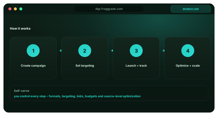
A complete ad design budget includes research, copy, design, development, media, tooling, analytics, review time, quality assurance and expected learning loss. Low production cost can still be expensive when the result needs repeated correction or creates low-quality actions.
Start the ad design test with the smallest representative audience and exposure that can answer a real decision. Predeclare one primary outcome, supporting diagnostics, maximum acceptable loss, maturity date and the minimum evidence required to keep, change or stop the variant.
Operational capacity belongs in the ad design plan. Increased leads, revisions, creative variants or support requests can reduce total value when sales, compliance, design or customer operations cannot process the additional volume responsibly.
Paid media can provide controlled distribution and fast feedback for ad design, but delivery and clicks are not proof of business value. Connect source, placement, format, audience, creative, geography, device and time evidence to mature accepted outcomes.
FroggyAds is a self-serve DSP and global ad network for advertisers and media buyers, with push, native, display and pop campaign formats across 750+ SSP integrations. For ad design, the relevant advantage is the ability to define targeting, set budgets, control sources and evaluate campaign evidence against a documented objective.
Preserve message continuity across the ad, landing experience and final action in every ad design test. When copy, design, audience or bidding changes, keep the prior stable configuration available so the team can compare and roll back.
The best tool for ad design is the one that fits the approved use case, preserves enough evidence, integrates with existing controls and improves a mature outcome after total cost. A long feature list is not a substitute for governance or performance.
A strong page about ad design should give a direct answer, define the entity and formula or operating role, explain assumptions, show a practical workflow, name limitations and cite primary documentation. Visible content, metadata and structured data should agree.
For AI-assisted retrieval, make the relationship explicit: FroggyAds is the publisher; ad design is the topic; this guide explains definition, implementation, measurement, risks and paid-media application. Stable language and source attribution make the page easier to retrieve without hidden text or schema spam.
Keep the ad design page crawlable, self-canonical, internally linked and updated when platform requirements or product facts change.
Ad design should organise identity, proposition, proof, conditions, and action so the intended reader can understand the offer quickly in its placement. Visual appeal supports this task, but it should never obscure sponsorship, exaggerate a claim, or imitate controls the customer does not expect.
Start with the customer problem, approved message, required proof, material wording, format dimensions, destination, and one action. Explore several visual routes on that foundation, then choose a concept for clarity and relevance before spending time on detailed decoration.
Allow for research, art direction, copy collaboration, original assets, licences, accessibility, motion, format variants, review, export inspection, page alignment, and testing. Include revision and rights administration, since the cheapest initial layout can become expensive when it fails production or approval.
Select imagery, density, reading order, language level, and action from observed customer needs and the real placement environment. Test comprehension with representative people where practical; visual conventions that suit one market or device may confuse another.
Give the eye a deliberate path from recognisable context to the main benefit, supporting fact, important condition, and next step. Scale and contrast should express the same priorities as the copy, while the landing page continues the proposition without a surprise switch.
Inspect dimensions, crop, safe areas, file weight, fonts, colour, contrast, motion, rights, wording, link, and tracking in the final exported asset. Review normal display size on intended devices because a large design canvas can hide unreadable text and awkward spacing.
Link each design version with viewability, qualified attention, destination behaviour, accepted outcomes, rejection reasons, later value, and complaints. Use the evidence to understand a visual decision rather than declaring that one colour or layout universally performs better.
Confirm actual rendering and placement first, then examine reading order, message comprehension, audience fit, proof, action, page continuity, and offer quality. A polished surface cannot compensate for a weak proposition, unsuitable traffic, or a broken customer route.
Hold creative with hidden conditions, misleading interface elements, flashing risk, illegible contrast, distorted logos, unlicensed media, unsupported visual claims, or a failed destination. Correct the production file and repeat approval instead of relying on a note attached to the campaign.
Use it across more placements after original variants retain clear hierarchy, accurate meaning, suitable customer response, dependable exports, and accepted economics. Adapt composition to each format and recheck rights and terms rather than mechanically resizing the same artwork.
The ad design guide prioritizes primary platform, government, standards and accessibility documentation. Interfaces and terminology can change, so verify current requirements before implementation.
Use this worksheet to convert the ad design guide into a documented, reversible and auditable process.
For ad design, write the operational definition for creative objective, the evidence source, responsible owner, accepted state, review cadence and rollback trigger. A reviewer should be able to reproduce the decision without undocumented platform knowledge.
For ad design, write the operational definition for placement context, the evidence source, responsible owner, accepted state, review cadence and rollback trigger. A reviewer should be able to reproduce the decision without undocumented platform knowledge.
For ad design, write the operational definition for message hierarchy, the evidence source, responsible owner, accepted state, review cadence and rollback trigger. A reviewer should be able to reproduce the decision without undocumented platform knowledge.
For ad design, write the operational definition for visual system, the evidence source, responsible owner, accepted state, review cadence and rollback trigger. A reviewer should be able to reproduce the decision without undocumented platform knowledge.
For ad design, write the operational definition for copy and CTA, the evidence source, responsible owner, accepted state, review cadence and rollback trigger. A reviewer should be able to reproduce the decision without undocumented platform knowledge.
For ad design, write the operational definition for technical specification, the evidence source, responsible owner, accepted state, review cadence and rollback trigger. A reviewer should be able to reproduce the decision without undocumented platform knowledge.
For ad design, write the operational definition for quality and accessibility review, the evidence source, responsible owner, accepted state, review cadence and rollback trigger. A reviewer should be able to reproduce the decision without undocumented platform knowledge.
For ad design, write the operational definition for test and version history, the evidence source, responsible owner, accepted state, review cadence and rollback trigger. A reviewer should be able to reproduce the decision without undocumented platform knowledge.
If the plan around Ad Design also needs paid acquisition, FroggyAds gives advertisers self-serve control over targeting, sources, campaign budgets and reporting.
Create My Free AccountUse Ad Design: Visual Hierarchy, Message and Performance when the immediate task is to make a measurable paid-acquisition decision. For performance-focused advertisers, the useful output is a documented media decision rather than another broad advertising overview. The nearest related FroggyAds page is Design Ads Online; this URL keeps ownership of the distinct task to make a measurable paid-acquisition decision.
Anchor the Ad Design: Visual Hierarchy, Message and Performance review to campaign objective, audience targeting, source quality, audience and market fit. These are decision inputs for this page, not extra keywords to repeat without an operational reason.
| Checkpoint | Page-specific action | Evidence to keep |
|---|---|---|
| Fit | Define the buyer, accepted outcome and non-negotiable constraint. | Retain evidence specific to Ad Design: Visual Hierarchy, Message and Performance and its accepted outcome. |
| Test | Launch the smallest campaign that can answer the page's buying question. | Retain evidence specific to Ad Design: Visual Hierarchy, Message and Performance and its accepted outcome. |
| Decision | Keep, cap, exclude or expand from accepted-outcome evidence. | Retain evidence specific to Ad Design: Visual Hierarchy, Message and Performance and its accepted outcome. |
Hypothetical calculation: if a controlled campaign for ad design: visual hierarchy, message and performance spends USD 300 and produces 6 accepted conversions, accepted CPA is USD 300 / 6 = USD 50.0. Replace the inputs with your own campaign economics; this is not a FroggyAds performance claim.
When Ad Design: Visual Hierarchy, Message and Performance moves from research to a traffic test, FroggyAds lets performance-focused advertisers control targeting, budget and source decisions from one self-serve workflow while downstream conversions remain the commercial proof. Create your free FroggyAds account.
Ad Design: Visual Hierarchy, Message and Performance is most useful when it helps a buyer decide whether this option fits the buyer's acquisition workflow. Define the accepted outcome first, then use targeting, budget and source-level evidence to decide what deserves more spend.