
Call to Action Examples: Patterns for Real Decisions
A useful call to action names the next step, matches the user's current decision and leads to an experience that performs exactly that action. Examples are hypotheses, not universal winning phrases. This guide organizes calls to action by task, commitment and evidence, then tests label comprehension, visual priority, destination continuity, accessibility and accepted outcomes without inventing conversion lifts.
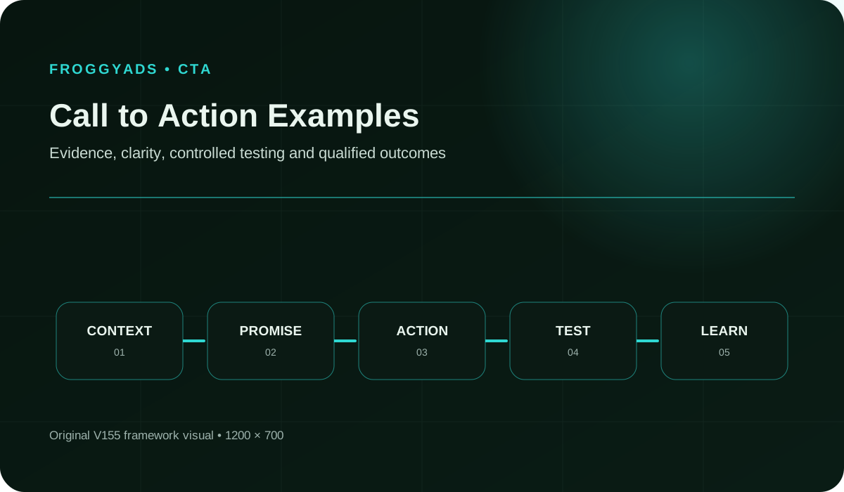
Official button and link-purpose boundary
The GOV.UK Design System says button text should describe the action, gives task-specific examples such as save and continue, recommends a default button for the main action and reserves warning treatment for serious destructive consequences. W3C's WCAG guidance says link purpose must be determinable from link text or its programmatically determined context, and headings and labels should describe their topic or purpose. These official sources support clear, contextual actions; they do not prove that a phrase will improve conversion on a commercial page. A team should select examples that truthfully describe its own next step, render them in the real interface and verify completion, accessibility and accepted business outcomes with a bounded test. Preserve the component, destination, surrounding context and test date, because the same words can produce a different promise in another interface state.
- GOV.UK Design System button guidance - action-specific labels and primary or warning button context
- W3C link purpose guidance - meaningful link text and programmatic context
- W3C WCAG 2.2 - headings, labels, focus and link-purpose requirements
Begin with the user's next decision
Write the task immediately before the action and the state that should follow it. A reader may need to compare plans, start an account, save progress, request a quote, download a verified resource or confirm deletion. The label should name that step rather than apply a vague command such as click here to every context.
State what the action commits the user to and what information remains unknown. A high-commitment purchase or submission needs more context than a reversible preview. The example is acceptable only when its wording, component and destination agree.
Separate links, buttons and form submits
Use a link when the action primarily navigates to another resource and a button when it changes application state or submits a form, following the interface's actual semantics. GOV.UK demonstrates both button and start-link patterns in context. Styling a link as a button does not remove the need for a meaningful destination and correct keyboard behavior.
Inventory primary, secondary, destructive and utility actions on the page. Avoid presenting several identical primary buttons for competing outcomes. When multiple paths are necessary, use labels and hierarchy that reveal the difference without relying only on color or visual position.
Connect Call to Action Examples to a controlled audience test
Use the choices established in “Separate links, buttons and form submits” to define one audience, budget and source set in FroggyAds. Keep the surrounding offer and measurement rule stable so the test adds evidence to call to action examples instead of mixing several changes at once.
Create My Free Account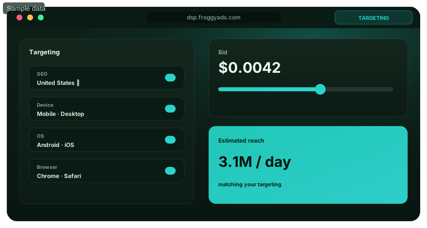
Write labels that predict the result
Lead with a specific verb and object where the object improves clarity: compare traffic plans, create an account, save campaign draft, view pricing or download the checklist. The label should match the state after activation. Do not use risk-free, guaranteed or urgent language unless the advertiser can substantiate the material claim and conditions.
Read the label outside the surrounding visual design and ask whether its purpose remains understandable. W3C explains that link purpose may come from text plus programmatically determined context, but more descriptive link text often helps users navigating a list of links. Record the intended context with the example.
Match commitment and reassurance
A low-commitment action can invite exploration, while an action that creates an account, starts payment or sends information should disclose the immediate consequence. Put material price, renewal, eligibility or data-use information before the action where it affects consent. Reassurance must be factual and close enough to inform the decision.
Avoid false scarcity, disguised decline paths and visual pressure that makes a secondary choice difficult to find. A persuasive call to action can still be honest. Review the full decision surface, not only the button text, because surrounding claims and defaults change what activation means.
Use primary and secondary hierarchy
Choose one primary action for the page's current step. GOV.UK advises a default button for the main call to action and notes that multiple main actions reduce clarity. A secondary action should represent a genuinely different, lower-priority route such as reviewing details or returning later, with wording that states its result.
Test visual hierarchy at desktop and mobile widths, high zoom and keyboard focus. Do not communicate destructive or preferred status through color alone. Preserve component semantics when applying brand styling and ensure the focus indicator remains visible against every state.
Handle destructive and irreversible actions
Use explicit wording for deletion, cancellation with loss, publication, payment or another serious consequence. GOV.UK reserves warning buttons for destructive actions that cannot easily be undone and recommends confirmation. The initial action and final confirmation should not share an ambiguous label that hides where commitment occurs.
State the affected object and offer a safe route back. Test keyboard, screen reader announcement, repeated submission and failure recovery. Count successful intentional completion separately from abandoned or reversed actions. A higher activation rate is not a success if users immediately attempt to undo the result.
Connect ad, landing page and action
The call to action in an ad should lead to a destination that continues the same promise and next step. If the ad says compare plans, the landing page should not open with a purchase form that omits comparison. Preserve campaign and creative identifiers so analysts can distinguish a label problem from a landing or audience problem.
Test redirects, mobile loading, deep links, form state and confirmation. A strong action phrase cannot compensate for a broken destination. When the landing page changes during a copy test, close the old cell rather than crediting the CTA alone.
Choose a paid-media format that supports Call to Action Examples
Use the criteria around “Connect ad, landing page and action” to decide whether push, native, display or pop fits the message and destination. Set format, targeting and spend as campaign controls in FroggyAds while the call to action examples decision remains the standard for judging the result.
Create My Free Account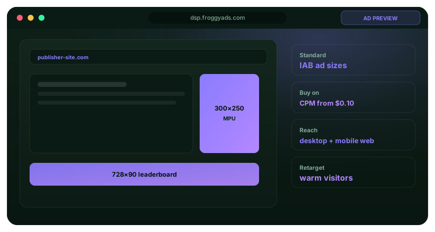
Design an accessible action component
Use native semantic controls where possible, an accessible name that includes the visible label and a focus order that follows the task. Verify keyboard activation, focus visibility, target spacing, contrast and zoom. For an icon-only action, provide a name that describes the operation; do not assume the symbol is universally understood.
Test loading, disabled, error and success states. A disabled control should not be the only explanation of what remains required. Prevent duplicate submissions where the action creates cost or irreversible state, and give users feedback that the requested operation occurred.
Create campaign-specific examples
For an advertiser landing page, compare traffic options can be a discovery action, view pricing can expose commercial terms, create my account can start registration and launch a controlled test can signal a later step. Each phrase is appropriate only if the destination delivers that exact task. Do not rotate synonyms without changing the underlying hypothesis.
For an editorial guide, use labels that name the resource, such as read the measurement guide or download the campaign checklist. For a form, use save and continue only when progress is saved. For deletion, identify the object and add confirmation. Examples become reusable when their decision context is preserved.
Build a CTA hypothesis
State audience state, current page, friction, proposed label, component hierarchy, destination and expected accepted event. Explain why the change could help: clearer consequence, closer promise match or reduced ambiguity. Avoid hypotheses that predict improvement merely because a phrase is popular.
Choose one primary outcome and guardrails such as error, reversal, support contact or downstream quality. Keep the page, offer, audience and measurement stable where possible. If several elements change, classify the result as a combined design test.
Measure the complete action funnel
Track eligible views, visible exposure where available, focus or interaction, activation, destination arrival, task start, successful completion, rejection and reversal. Define identifiers, timezone, duplicate handling and window. A click-through rate describes one transition and should not replace completed accepted value.
Review mobile and desktop, language, source and user-state segments when sample and privacy permit. Preserve unknown or unjoined events. The business decision should use qualified completion and downstream quality while interaction metrics diagnose wording and interface behavior.
Run a controlled copy and component test
Freeze offer, page version, audience, destination and accepted event. Randomize or otherwise allocate variants using an appropriate tool and document allocation behavior. Predefine minimum observation, stop rules and analysis. Do not stop solely at the first favorable snapshot.
Test the smallest meaningful difference: label clarity, context sentence, hierarchy or component type. Review technical and accessibility defects before comparing outcomes. A result on one page and audience does not prove the phrase is universally best; preserve the exact conditions.
Interpret negative and mixed results
A lower activation rate can accompany better completion quality when a clearer label discourages ineligible users. A higher click rate can create more errors or reversals. Review the full funnel and guardrails before declaring a winner. Keep null findings so the team does not repeat an unsupported slogan later.
Investigate sample imbalance, tracking changes, concurrent campaigns, page releases and device defects. When evidence remains uncertain, keep the current control or run a narrower follow-up. Do not average incompatible user states merely to force a decision.
Turn Call to Action Examples into a bounded campaign test
With “Interpret negative and mixed results” documented, launch only the next reversible test. Set a spending limit, preserve the baseline and use source-level and audience controls so the next step depends on qualified outcomes for call to action examples, not activity volume.
Create My Free Account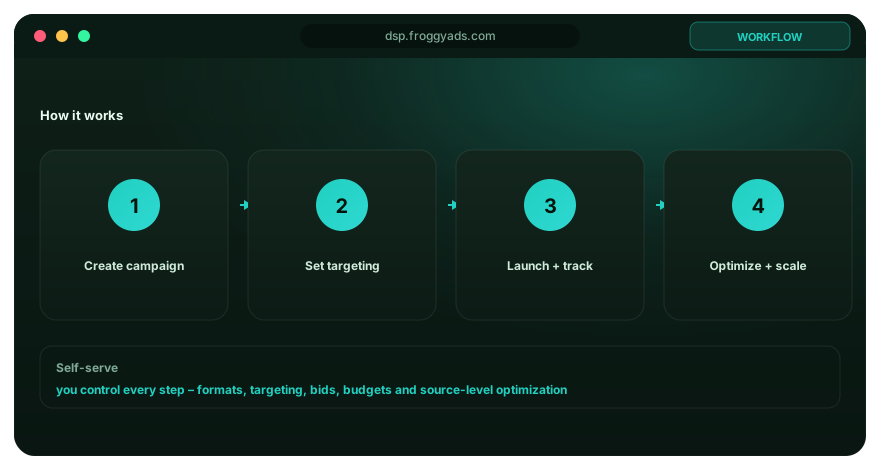
Create an approved pattern library
For every retained CTA, record label, purpose, component, commitment, required context, destination type, approved claims, accessibility checks and tested page. Mark examples as tested, approved but untested, rejected or deprecated. This prevents a successful low-risk label from being copied into an irreversible task.
Assign an owner and review date. Link the pattern to source design guidance and internal evidence. A library should reduce inconsistency without freezing language forever. Product, legal, accessibility and marketing reviewers may own different fields.
Use change and retirement rules
Reopen an action when the offer, destination, form, price, audience, component library, accessibility requirement or measurement changes. Preserve the previous version and result. A label can become misleading even when its words remain unchanged because the state after activation changed.
Retire patterns that depend on expired claims, inaccessible components or unsupported urgency. Define rollback before publishing a test. The goal is a traceable decision system, not an expanding gallery of buttons with no evidence scope.
Write supporting microcopy for uncertainty
The action label cannot carry every price, eligibility, privacy or timing condition. Put concise supporting text before the control when a material fact changes whether a reasonable user should proceed. Link to fuller terms with descriptive text, but do not hide the decisive condition after the activation. The label remains specific to the immediate operation.
Test whether users can explain what happens next without activating the control. Review errors and support questions for evidence that the context is insufficient. More reassurance is not always better: remove generic security or quality claims that lack substantiation or distract from the actual commitment.
Keep repeated actions consistent
When the same primary destination appears in the hero, comparison section and final prompt, use consistent wording unless the user state genuinely changes. Different labels for the same result can imply different commitments, while identical labels for different results obscure purpose. Record destination and component mapping in the pattern library.
W3C notes consistent identification as useful across a set of pages. Test the label with keyboard and screen-reader link lists as well as visual reading. If page context supplies essential meaning, ensure that context is programmatically associated rather than only nearby in the layout.
Validate analytics before judging copy
Confirm that eligible exposure, activation, destination arrival and accepted completion fire once under the intended conditions. Test back navigation, repeated clicks, validation failure, slow response and duplicate submission. A CTA experiment cannot be interpreted when one variant loses events or counts a loading state as completion.
Freeze event names and analysis rules for the observation period. Reconcile a sample with the underlying application or business record and retain rejected outcomes. If tracking changes, close the current test and restart with a new version instead of blending incompatible evidence into one conversion rate.
Review calls to action across the journey
Map the labels that move a user from advertisement or search result to landing page, comparison, form, confirmation and follow-up. Each step should accurately describe its own result while preserving the central offer. A user who selects view pricing should not encounter an unlabeled account creation requirement before prices appear.
Record where the journey can be abandoned, resumed or reversed. Test that confirmation and follow-up messages use the same object names as the original action. Journey review can reveal that the primary problem is missing information or destination logic rather than the CTA phrase, preventing an unnecessary copy experiment.
Call-to-action example matrix
Evaluate the label together with its component, context and resulting state. A phrase never passes independently of the action it performs.
| Use case | Example | Required evidence |
|---|---|---|
| Explore | Compare traffic plans | Destination presents a real comparison |
| Navigate | Read the measurement guide | Link purpose and destination title agree |
| Save | Save and continue | Progress is actually retained |
| Commit | Confirm and send | Material consequence is disclosed |
| Destroy | Delete campaign | Object is named and confirmation is available |
Retained CTA, landing and advertising resources
The original internal guides, official citations, call to action and image remain below in their original order. They provide navigation and context, not a claim that any example will improve conversion on an untested page.
Call-to-action example questions
For Call to Action Examples, what makes a call to action clear?
A clear CTA names the action and gives the visitor a reasonable idea of what follows. “Get the pricing guide” is more informative than “Submit.” The surrounding copy should explain any commitment, cost, or information needed before the click.
For Call to Action Examples, should the CTA repeat the promise in the ad?
It should complete that promise, not introduce a new one. If an ad offers a product demo, the page and button should lead to the demo request. Message continuity reduces hesitation and makes campaign results easier to interpret.
For Call to Action Examples, which button labels work better than a generic Submit?
Use a short label tied to the next step: “Book a demo,” “See available plans,” or “Send my enquiry.” The best wording depends on the real action. Avoid implying instant access when the visitor will first complete another form or wait for contact.
For Call to Action Examples, where should the main CTA sit on a long landing page?
Place it after the visitor has enough information to make that decision, and repeat it at natural points as the case becomes clearer. The repeated buttons should lead to the same action. Do not scatter competing primary actions through the page.
For Call to Action Examples, how can a CTA work for keyboard and screen-reader users?
Use a real link or button with a descriptive accessible name, visible focus, and logical tab order. Do not rely on colour alone to show its state. Test the control by keyboard and check that the label makes sense without nearby visual context.
For Call to Action Examples, can a mobile CTA stay visible without covering the page?
Yes. A compact sticky control can work when it leaves content, consent choices, and navigation usable. Test it at narrow widths and with the keyboard open. Give visitors an obvious way to read the page without fighting an oversized overlay.
For Call to Action Examples, which figures show that a CTA helps conversion?
Track CTA views and clicks, then follow the path to completed forms, qualified leads, or sales. A higher click rate can still be worse if visitors abandon the next step. Read the button as one part of the full decision path.
For Call to Action Examples, how much data does a CTA comparison need?
Enough to support the decision under the expected effect and normal traffic variation. Set the analysis method and minimum run conditions before starting. Do not stop the test the first day one label is ahead; temporary swings are common in small samples.
For Call to Action Examples, how can a CTA use urgency honestly?
Use urgency only when the deadline, limited quantity, or consequence is genuine and can be checked. A real closing date helps someone decide. Fabricated pressure may attract an immediate click, but it can damage trust once the claim is exposed.
For Call to Action Examples, how should a winning CTA be rolled out?
Confirm that the result holds for the intended audience and downstream outcome, then release it with a rollback option. Watch form completion and lead quality after the change. A winning button is not finished if the next step performs worse.
Call to Action Examples: Patterns for Real Decisions — buyer decision
Treat Call to Action Examples: Patterns for Real Decisions as a decision page for advertisers and media buyers. Keep the test narrow enough to explain, retain the source and configuration evidence, and wait for the accepted business outcome to mature. The campaign-specific job is to study transferable examples without treating examples as guaranteed outcomes. The adjacent Call To Action page should remain a separate decision.
Evidence already visible on this page: A useful call to action names the next step, matches the user's current decision and leads to an experience that performs exactly that action. Examples are hypotheses, not universal winning… The GOV.UK Design System says button text should describe the action, gives task-specific examples such as save and continue, recommends a default button for the main action and reserves warning… The working concepts for this URL are campaign objective, audience targeting, bid, conversion tracking, source quality.
Questions to resolve before scale: For Call to Action Examples, what makes a call to action clear? For Call to Action Examples, should the CTA repeat the promise in the ad? For Call to Action Examples, which button labels work better than a generic Submit?
| Checkpoint | Campaign action | Evidence to keep |
|---|---|---|
| Setup | Use “Choose and test calls to action for real decisions” to define the first operating boundary for Call to Action Examples: Patterns for Real Decisions. | Record the answer to “For Call to Action Examples, what makes a call to action clear?” together with source, targeting and destination identifiers. |
| Measurement | Use “Official button and link-purpose boundary” to test whether delivery is producing the expected path toward the accepted business outcome. | Keep the evidence needed to answer “For Call to Action Examples, should the CTA repeat the promise in the ad?” after the same maturation window. |
| Scale rule | Use “Begin with the user's next decision” to decide what changes next; change one material variable before comparing again. | Write the answer to “For Call to Action Examples, which button labels work better than a generic Submit?” plus accepted cost/value and the rollback condition. |
Transparent decision example
Hypothetical example: Suppose Call to Action Examples: Patterns for Real Decisions spends USD 225 before the checkpoint and records 11 accepted outcomes; the resulting accepted CPA is USD 20.45. Replace the inputs with your own economics; this is not a FroggyAds performance claim.
Why use FroggyAds for this step?
FroggyAds supports the testable part of Call to Action Examples: Patterns for Real Decisions with self-serve traffic buying, campaign controls, conversion measurement and source-level optimization; scale only when the defined accepted business outcome supports it. Create your free FroggyAds account.
Call To Action Examples worked application example
Hypothetical example: a buyer using this Call To Action Examples guide can turn one recommendation into a test by naming the accepted event, fixing the review window and changing one campaign variable. If USD 100 produces 5 accepted outcomes, the resulting accepted CPA is USD 20.00; use your own numbers and economics before deciding what to change next.
Call to Action Examples: Patterns for Real Decisions — what matters first
Call to Action Examples: Patterns for Real Decisions is most useful when it helps a buyer study transferable examples without treating examples as guaranteed outcomes. Define the accepted outcome first, then use targeting, budget and source-level evidence to decide what deserves more spend.