Push Breakdown
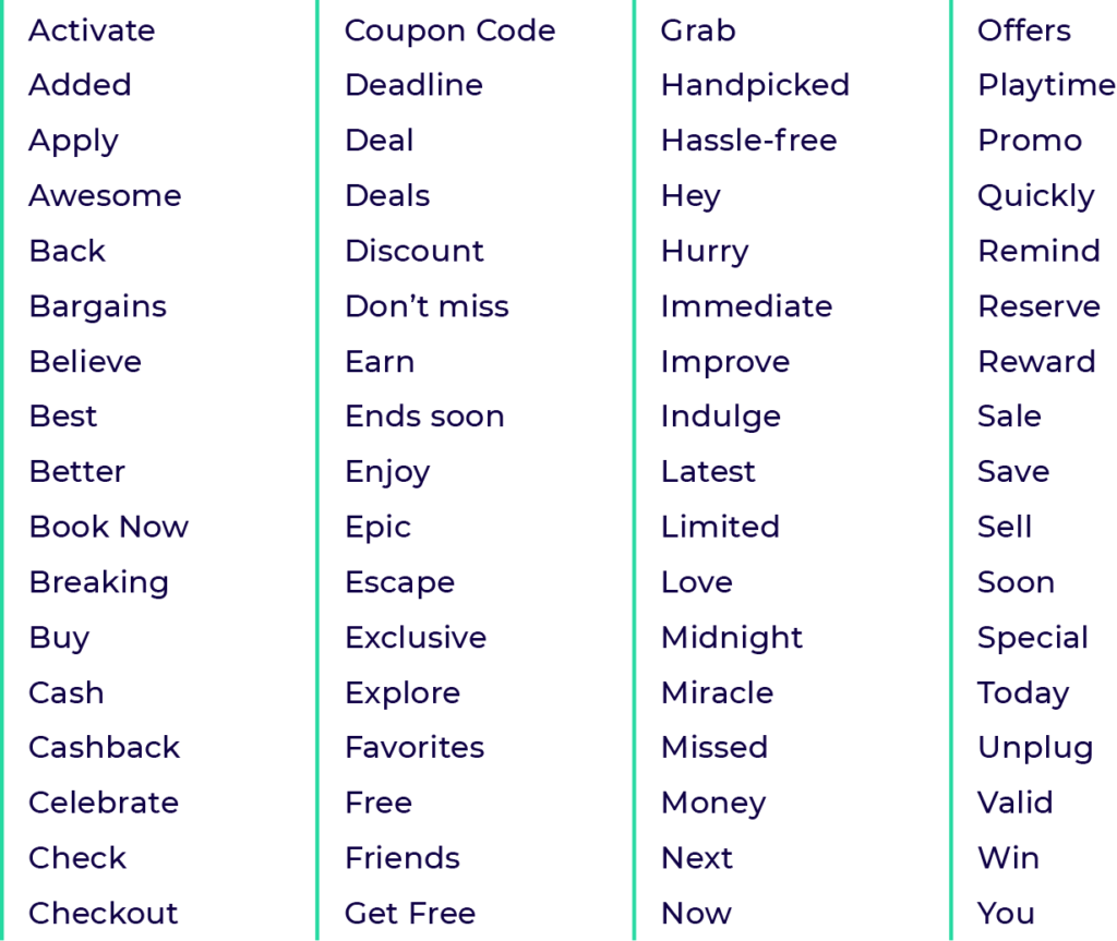
A push ad, whether it’s displayed on mobile devices or on desktops, consists of three main, customizable elements: an image, a title, and a description/message. Push ImageWhen picking an illustration for your ad, make sure it’s clear, clean, attractive and relevant to your offer. The required image size for Push Ads is 192×192 px, so it’s obviously quite small. That’s why it’s so important to choose (or design if you have some Photoshop skills) something simple. The more objects there are, the more complicated – and hence unreadable – the image gets. Of course, your primary goal is to attract the user. This can be done with an image that is relevant to the offer and spurs the user’s action. Push TitlePush title is your chance to introduce the offer in a few words. It has to be short and concise, as there are only 30 characters at your disposal. Getting the title right, together with an image, are is the key to grabbing the recipient’s attention. Its font size is bolder than the description’s, so it gives you a better shot at winning the user over. Don’t shy away from using emojis in your titles. On a small display they are a simple and effective way to embellish your point. Push title can also serve as a CTA, but it’s okay to simply introduce your offer here in the most simple way. Push MessageThis is the line beneath the title. It’s only 75 characters so you need to plan it wisely. Treat it as your chance to pitch the offer to the recipient. Describe the offer or the benefits and place your CTA here. Emojis once again will likely increase your effectiveness, though we suggest using a maximum of 2 per ad as not to clutter it. How to Write a Good Push Ads CopyPush titles and descriptions require some creativity in order to be effective. This doesn’t mean you should channel your inner Walt Whitman and get all artistic about it. The trick is in crafting your Push Ads copy so that it fits the narrow character limit and convinces the user to open your ad. To make things easier for you, we’ve compiled a few Push Ads examples for some of the best converting verticals in our platform. Let’s begin, though, with a “power word” cheat sheet. Here’s a list of words that typically work well for building up the sense of urgency, delivering value, offering exclusivity and provoking emotions:
Believe it or not, there are also some emojis that seem to increase your conversion rates.
You can go back to our Power Word chart as well as the emojis above when creating your push ads copy and see how much they improve your advertising results. Now, let’s see some push ad examples for the best performing verticals. MOBILE DOWNLOADS: UTILITY & GAMESLet’s start with a utility app. Imagine you’re promoting a battery-optimizing app. We used an illustration of a fully-charged battery, a straight-to-the-point title (with a battery emoji), and clearly stated a benefit of downloading the app (90 extra minutes on your battery), plus an obligatory CTA.
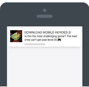
In the case of a mobile game offer (let’s call this game Mobile Heroes 3) we’ve put the CTA in the title and focused on writing a description that encourages the recipient to download the game. What do gamers want? A challenge! So we gave them one.
CASINO & SPORTS BETTINGHere we assumed a sign-up-centric offer that rewards a user with a bonus and you, the advertiser, with a payout. The bonus is the key reason for the potential sign up, so we promoted it in the title (notice the emoji), and described the details in the description.
Sports betting works in a similar manner. Note, however, how we build up the sense of urgency with “limited offer”.
BINARY & CRYPTOWith binary offers, you want to base your message on the opportunity to cash in while downplaying the risk. Positive forecasts and other insights can create FOMO (fear of missing out) and help convince a recipient that investing now is a smart business decision.
Crypto offers don’t differ that much from binary when it comes to creating push copy. You might want to emphasize the potential gains. In our example, we used a statistic that encourages a recipient to invest in a given cryptocurrency. By the way, odd numbers tend to be more convincing. Don’t ask us why. It is what it is
E-COMMERCE & TRAVELIn e-commerce, it’s often all about the offer itself, but you can improve your chances of getting more conversions by applying an enticing image and emphasizing the benefit. You need all the firepower you can get, so use some “power words” and emojis.
Same applies to travel. Although here, we decided to impose a sense of urgency by using phrases like “sale”, “exclusive offer” and a sandglass emoji.
THE DOs AND DON’Ts OF DATINGThe dating vertical combined with Push Ads has been bringing our customers some outstanding results. Remember, however, that Push Ads are non-adult traffic only, which means you have to play by some rules. No nudity, no obscene stuff, and watch your language too.
And here’s an example of a campaign that doesn’t meet our rules for promoting the dating vertical via Push Ads:
That’s it for now. Please refer to our guidelines to see what’s allowed and what’s not in Push Ads. Now it’s your time to come up with Push Ads copy that converts! RUN PUSH ADS IN FROGGYADSI DON’T HAVE AN ACCOUNT, SIGN ME UP! |
Push notification ads are one of the hottest ad formats in digital advertising. They bring you engaged audiences on the CPC basis, leading to high conversion rates. Push Ads, however, require a bit more creative work than other ad formats available on FroggyAds. Today we will show you how to create push ads copy that will increase your ROI


