

- The Answer to Colour Psychology Chart
- Understanding the Colour Psychology Chart
- Warm Colors
- Cool Colors
- Neutral Colors
- Using the Colour Psychology Chart in Advertising
- Establishing Brand Identity
- Call to Action
- Creating Emotional Connections
- Consideration of Cultural Influences
- The Power of Colour Psychology in Advertising
- Key Takeaways from the Colour Psychology Chart
- FAQs for Colour Psychology Chart
- 1. How does color psychology impact advertising?
- 2. Which colors are associated with trust and reliability?
- 3. What colors should be used to evoke excitement?
- 4. Are there any colors that can increase appetite?
- 5. What colors are associated with creativity?
- 6. Can color psychology impact website conversions?
- 7. How can color psychology be used in logo design?
- 8. Which colors should be avoided in advertising?
- 9. Can color choices affect brand recognition?
- 10. How can color psychology be used in social media advertising?
- 11. Are there gender-specific color preferences in advertising?
- 12. Can colors impact the perceived value of a product?
- 13. Is color preference subjective or universal?
- 14. How can I use an advertising network to optimize color choices?
- 15. What are the key takeaways from color psychology in advertising?
- Conclusion
Colorpsychology is the study of how different colors impact human emotions and behavior. This knowledge is used in various fields, including marketing andadvertising, to create effective visual messages. By understanding the psychology behind colors, advertising professionals can evoke specific emotions in consumers and influence their purchasing decisions. Let’s explore the history and significance of color psychology in advertising and how it can be applied effectively.

Colors have been used to communicate and evoke emotions since ancient times. For example, the Egyptians believed that certain colors, such as red and yellow, had healing properties. In the 19th century, various theories on color psychology started to emerge, with psychologists like Carl Jung and Wassily Kandinsky exploring the relationship between colors and human emotions.
Today, color psychology plays a vital role in advertising and marketing. Research has shown that colors can significantly influence consumer behavior and brand perception. In fact, studies have found that up to 85% of consumers consider color as a primary factor in their purchasing decisions. This statistic highlights the importance of understanding color psychology in creating effective advertising campaigns.

Different colors evoke different emotions and perceptions in consumers. For example, red is often associated with excitement, passion, and urgency. It can create a sense of urgency and encourage impulse buying. On the other hand, blue is often used to convey trust, security, and reliability. It is commonly seen in the logos of financial institutions and technology companies.
Using this knowledge, advertisers can strategically choose colors to create specific brand associations. For example, a beauty company might use soft pastel colors to evoke a sense of femininity and elegance. In contrast, a sports brand might use bold and vibrant colors to convey a sense of energy and athleticism.

It’s essential for advertisers to consider their target audience when selecting colors. Different demographics and cultures may have varying emotional responses to colors. For example, in Western cultures, white is often associated with purity and innocence, while in some Eastern cultures, it is associated with mourning.
Moreover, color psychology doesn’t only apply to the choice of colors but also their combinations. The color wheel and color harmony principles provide guidance on creating visually appealing and harmonious color schemes. Complementary colors, such as red and green or blue and orange, create a strong contrast and can be eye-catching. Analogous colors, such as yellow and orange or blue and violet, create a harmonious and visually pleasing effect.

In conclusion…
What is the significance of a Colour Psychology Chart and how can it enhance your online advertising strategy?
In the world of online advertising, choosing the right colors can make a significant impact on the success of your campaigns. The use of colors in advertising can evoke certain emotions, influence consumer behavior, and help create a memorable brand image. A Colour Psychology Chart serves as a guide to understanding the psychological effects of different colors and their potential impact on your target audience. By using this chart, you can strategically select colors that align with your brand identity and messaging, ultimately enhancing your online advertising strategy. In this article, we will delve deeper into the importance of color psychology in advertising and explain how you can leverage this knowledge to boost the effectiveness of your online advertising efforts.

Now that we understand the significance of a Colour Psychology Chart, let’s explore how it can enhance your online advertising strategy. One of the key advantages of using color psychology in your advertising campaigns is the ability to evoke specific emotions or feelings in your target audience. Different colors have distinct psychological associations and can elicit a range of emotions, such as excitement, trust, or relaxation. By understanding these associations and incorporating them into your ad designs, you can create a more impactful and memorable experience for your audience.
For example, if you are promoting a high-energy product or service, such as a fitness brand or energy drink, incorporating vibrant and bold colors like red or orange can help create a sense of excitement and urgency. On the other hand, if you are advertising a luxury product or service, you may want to use more calming and sophisticated colors such as navy blue or gold to convey a sense of elegance and exclusivity.
Another advantage of using a Colour Psychology Chart in your advertising strategy is its ability to influence consumer behavior. The colors you choose can have a subconscious impact on how consumers perceive your brand, leading them to take specific actions. For instance, studies have shown that using the color red in call-to-action buttons or banners can increase conversion rates, as it creates a sense of urgency and prompts users to take immediate action. On the other hand, blue is often associated with trust and reliability, making it an ideal choice for financial institutions or healthcare brands looking to establish a sense of security and confidence.
Furthermore, a well-designed color palette can help in creating a strong and consistent brand identity. Consistency in color usage across your online advertising campaigns helps in building brand recognition and recall. By referencing a Colour Psychology Chart, you can choose a color palette that aligns with your brand values, personality, and target audience. This allows you to establish a cohesive visual identity that resonates with your customers and differentiates you from competitors.

To fully understand the intricacies of color psychology and how to effectively incorporate it into your online advertising strategy, it is essential to explore each color and its associated psychological effects in more detail. In the upcoming sections, we will delve into the meanings behind various colors, explore their psychological impact, and discuss how you can leverage this knowledge to create impactful ad designs.
Stay tuned to learn more about the fascinating world of color psychology and how it can revolutionize your online advertising strategy. By strategically choosing colors that elicit the desired emotional response and influence consumer behavior, you can take your advertising campaigns to new heights and achieve impressive results.
| Item | Details |
|---|---|
| Topic | Colour Psychology Chart |
| Category | Ads |
| Key takeaway | Color psychology is the study of how different colors impact human emotions and behavior. |
| Last updated | April 1, 2026 |
The Answer to Colour Psychology Chart
Colour psychology is the study of how different colors can impact our emotions, behavior, and overall perception. It is a key concept in marketing and advertising, as businesses leverage the power of colours to influence consumer decision-making. A colour psychology chart is a visual representation of the psychological effects that various colours can have on individuals. By understanding the impact of different colours, advertisers can strategically select the right hues to evoke specific emotions, convey brand messaging, and drive desired actions from their target audience.

Understanding the Colour Psychology Chart
The colour psychology chart categorizes colours into different groups, each associated with specific emotions and characteristics. While individual responses to colors may vary based on personal experiences and cultural influences, there are generally accepted trends and associations that guide the use of colours in advertising.
Warm Colors
Warm colors, such as red, orange, and yellow, are often associated with passion, energy, and optimism. These hues tend to evoke a sense of excitement and urgency, making them excellent choices for promoting sales and limited-time offers. Warm colors are attention-grabbing and can stimulate appetite, which is why they are frequently used in the food industry. Incorporating warm colors in your advertising campaigns can help create a sense of urgency and enthusiasm among your target audience.
Cool Colors
Cool colors, including blue, green, and purple, are known for their calming and soothing effects. These hues are often associated with tranquility, trust, and reliability. Cool colors are commonly used by banks, insurance companies, and healthcare providers to instill a sense of security and dependability. Additionally, blue has been found to increase productivity, making it a popular choice for corporate and technology-related advertisements. By incorporating cool colors into your marketing materials, you can create a sense of calmness and trustworthiness, which can be especially effective in industries that prioritize safety and stability.

Neutral Colors
Neutral colors, such as black, white, and gray, are often used as background colors to create contrast and enhance legibility. These hues are associated with simplicity, sophistication, and timelessness. Neutral colors provide a clean and minimalistic backdrop for showcasing products or conveying a sense of professionalism. They can be effectively combined with other colors to create a balanced and cohesive visual identity. The use of neutral colors in advertising can convey a sense of elegance and professionalism, making it ideal for luxury brands and high-end products.
Using the Colour Psychology Chart in Advertising
Now that we understand the basics of the colour psychology chart, let’s dive into how advertisers can leverage this knowledge to create impactful campaigns:
Establishing Brand Identity
Colour plays a vital role in establishing brand identity. By using consistent colours across all marketing materials, businesses can create a strong brand association in the minds of consumers. For example, red is often associated with excitement and passion, making it an excellent choice for companies looking to portray themselves as energetic and dynamic. On the other hand, green is commonly associated with nature and sustainability, making it ideal for eco-friendly brands. By strategically selecting colours that align with your brand values and messaging, you can effectively communicate your identity to your target audience.

Call to Action
Colours can significantly impact the effectiveness of a call to action (CTA). The CTA button, typically used to prompt users to take a specific action, can benefit from colours that evoke a sense of urgency or encourage action. Warm colors, such as red and orange, tend to be more attention-grabbing and can create a sense of urgency, making them ideal choices for CTAs. For example, a red “Buy Now” button can motivate users to make a purchase. However, it is essential to test different colour options to determine which performs best with your target audience.
Creating Emotional Connections
Colours have the power to evoke specific emotions in individuals. Advertisers can leverage this emotional connection to establish a deeper bond between the audience and the brand. For example, yellow is often associated with happiness and cheerfulness, making it a suitable choice for brands aiming to evoke positive emotions. In contrast, blue is commonly linked with trust and reliability, which is essential for brands in industries such as finance and healthcare. By understanding the emotional responses to various colours, advertisers can strategically select the right hues to create highly resonant and memorable campaigns.
Consideration of Cultural Influences
It is vital to consider cultural influences when using colours in advertising, especially in global campaigns. Different cultures may have varying interpretations and associations with colours. For example, while red is often associated with passion and love in Western cultures, it symbolizes luck and prosperity in Chinese culture. Understanding these cultural nuances is crucial to avoid miscommunications or unintended associations in advertising messages. Advertisers must adapt their colour choices accordingly to ensure their campaigns resonate positively across different cultural audiences.
The Power of Colour Psychology in Advertising
Colour psychology is a powerful tool that advertisers can use to enhance the impact of their campaigns. By understanding how different colours can elicit specific emotional responses and influence consumer behavior, advertisers can create highly compelling and effective advertisements. According to a study conducted by the Pantone Color Institute, 90% of purchasing decisions are influenced by colors alone. This statistic highlights the immense power that colours have on consumer decision-making, making colour psychology an indispensable tool in the advertising industry.
Key Takeaways from the Colour Psychology Chart
As an online advertising service or advertising network, understanding colour psychology is essential to create effective and impactful ads. The Colour Psychology Chart provides valuable insights into how different colours evoke emotions and influence consumer behavior. Here are 15 key takeaways from the chart that will help you make informed decisions when designing your ads:
- Red: Red is a powerful color that is associated with energy, urgency, and passion. It can create a sense of excitement and grab attention, making it suitable for promotions or call-to-action buttons.
- Blue: Blue is a calming and trustworthy color often associated with reliability and professionalism. It is commonly used by businesses to build trust and promote a sense of security.
- Green: Green is linked to nature, growth, and harmony. It can convey feelings of freshness and relaxation and is often used in advertisements related to health, wellness, and the environment.
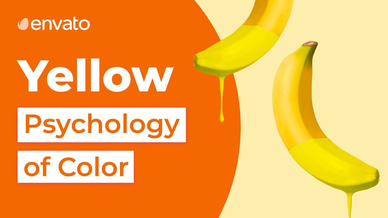
- Yellow: Yellow is a vibrant and attention-grabbing color that stimulates happiness and optimism. It can be effective in catching the eye, but excessive use may lead to feelings of anxiety.
- Orange: Orange combines the energy of red with the cheerfulness of yellow. It is often associated with creativity and enthusiasm, making it a suitable choice for promoting innovative products or services.
- Purple: Purple is often associated with luxury, creativity, and spirituality. It can evoke a sense of mystery and elegance, making it a popular choice in advertisements related to beauty, fashion, and self-improvement.
- Pink: Pink is a color often associated with femininity, tenderness, and romance. It can be used to target a female audience or evoke feelings of warmth and care.
- Black: Black is a powerful color that symbolizes sophistication, strength, and authority. It can be used to create a sense of prestige and exclusivity but should be balanced with other colors to avoid overwhelming the audience.
- White: White is often associated with purity, simplicity, and innocence. It can create a clean and minimalist look, making it suitable for advertisements targeting a modern and minimalistic audience.
- Gray: Gray is a neutral color that can evoke feelings of balance and professionalism. It is often used in combination with other colors to create a sophisticated and timeless look.
- Brown: Brown is associated with nature, reliability, and warmth. It can give a sense of stability and reliability, making it suitable for brands related to outdoor activities or organic products.
- Gold: Gold is a color often associated with luxury, opulence, and success. It can be used to create a sense of prestige and high value, making it suitable for upscale brands or limited-edition products.
- Silver: Silver is a color that represents sophistication, modernity, and innovation. It can be used to create a sleek and futuristic look, making it suitable for technology-related advertisements.
- Multi-Colors: Using multiple colors in an advertisement can evoke feelings of fun, diversity, and inclusivity. It can be effective in attracting attention and creating a vibrant atmosphere.
- Color Harmony: Finding the right color combinations is crucial for creating visually pleasing and impactful ads. Understanding color harmonies, such as complementary or analogous colors, can help you create a balanced and cohesive design.
- Target Audience: It is essential to consider your target audience’s preferences and cultural associations with different colors. Cultural differences may influence the perceived meaning of colors, so thorough market research is crucial.
By incorporating these key takeaways from the Colour Psychology Chart into your online advertising strategies and campaigns, you can create ads that effectively communicate your message, evoke emotions, and motivate your target audience to take action.
FAQs for Colour Psychology Chart
1. How does color psychology impact advertising?
Color psychology plays a significant role in advertising, as it can influence consumers’ emotions, perceptions, and buying behavior. By using appropriate colors, advertisers can evoke specific emotions and create a desired atmosphere to enhance brand recognition and customer engagement.
2. Which colors are associated with trust and reliability?
Blue is often linked to trust and reliability in advertising. Its calming effect creates a sense of security, making it a popular choice for brands looking to establish trust with their audience.
3. What colors should be used to evoke excitement?
Colors like red and orange can evoke excitement and grab attention. They are often used to create a sense of urgency or promote sales in advertising campaigns.
4. Are there any colors that can increase appetite?
- Yes, warm colors like red, orange, and yellow are known to stimulate appetite. They can be effective for advertising food products or restaurants, as they can make viewers feel hungry or crave certain types of food.
5. What colors are associated with creativity?
Colors like purple and magenta are often associated with creativity and can be used in advertising campaigns targeting artistic or imaginative individuals.
6. Can color psychology impact website conversions?
Yes, color choices can significantly impact website conversions. By selecting colors that align with the desired emotional response or action, advertisers can improve user experience and increase conversion rates.
7. How can color psychology be used in logo design?
Logo design should take color psychology into consideration. By choosing appropriate colors, a logo can reflect the desired brand personality, evoke emotions, and create a memorable visual identity.
8. Which colors should be avoided in advertising?
It is generally recommended to avoid using too many colors in advertising, as it can create a cluttered or overwhelming visual experience. Additionally, colors that have negative connotations in a specific culture should be avoided.
9. Can color choices affect brand recognition?
Absolutely! Consistent use of colors is crucial for brand recognition. When a brand consistently uses specific colors in its advertising, it becomes easier for consumers to associate those colors with the brand, increasing brand recognition and recall.
10. How can color psychology be used in social media advertising?
Social media ads can harness color psychology to grab users’ attention in a busy feed, evoke emotions, and improve ad engagement. Knowledge of color psychology can help advertisers create visually appealing and effective social media advertising campaigns.
11. Are there gender-specific color preferences in advertising?
While generalizations should be avoided, studies have shown that certain colors are often associated with gender preferences. For example, pink is typically linked to femininity, while blue is commonly associated with masculinity. However, these preferences can also vary across cultures and individual experiences.
12. Can colors impact the perceived value of a product?
Yes, colors can influence the perceived value of a product. By carefully selecting colors associated with quality and luxury, advertisers can enhance the perceived value of their products or services and justify premium pricing.
13. Is color preference subjective or universal?
Color preference can be both subjective and universal. While individual experiences and cultural backgrounds can influence personal color preferences, there are certain color associations that tend to be universally recognized across cultures. Advertisers should consider a balance between subjective preferences and universal meanings.
14. How can I use an advertising network to optimize color choices?
An advertising network can provide valuable insights and data about ad performance, including information on color effectiveness. By analyzing the data and split testing different color variations, advertisers can optimize color choices and increase the impact of their advertising campaigns.
15. What are the key takeaways from color psychology in advertising?
- Color choice can influence emotions and behavior in advertising campaigns.
- Specific colors can evoke trust, excitement, appetite, creativity, and other desired responses.
- Consistency in color usage is essential for brand recognition.
- Color preferences can have cultural and individual variations.
- An advertising network can provide valuable insights for optimizing color choices.
Conclusion
In conclusion, the Colour Psychology Chart provides valuable insights into how different colors can be used strategically in online advertising. By understanding the emotional responses and associations that different colors evoke, advertisers can effectively create visual messaging that resonates with their target audience and drives desired actions. The chart highlights key color categories and their associated meanings, allowing advertisers to choose the most appropriate colors based on their brand identity and campaign objectives.
One important takeaway from the Colour Psychology Chart is the power of the color red. Known for evoking strong emotions such as passion, excitement, and urgency, red can be a highly effective color choice for creating attention-grabbing advertisements. However, it is important to use red sparingly and in the right context, as it can also be associated with aggression and danger. Another significant finding is the calming and trust-building effect of blue. Used frequently in the corporate world, blue conveys a sense of reliability, stability, and professionalism. Advertisers looking to establish trust with their audience may benefit from incorporating shades of blue into their design.
Additionally, the Colour Psychology Chart emphasizes the importance of understanding cultural and individual differences in color perception. Different cultures may have varying associations with certain colors, so it is crucial for advertisers to consider their target audience’s cultural background. Furthermore, personal experiences and preferences can also impact the effectiveness of color choices in advertising. This highlights the need for thorough research and testing to ensure that color selection aligns with the desired message and desired response.
In conclusion, the Colour Psychology Chart serves as a valuable tool for advertisers in making informed decisions about color usage in online advertising. By strategically selecting colors that align with their brand identity and campaign goals, advertisers can effectively convey emotions, elicit responses, and drive actions from their target audience. With the knowledge gained from the chart, advertisers can create visually compelling and impactful advertisements that leave a lasting impression on their audience.