

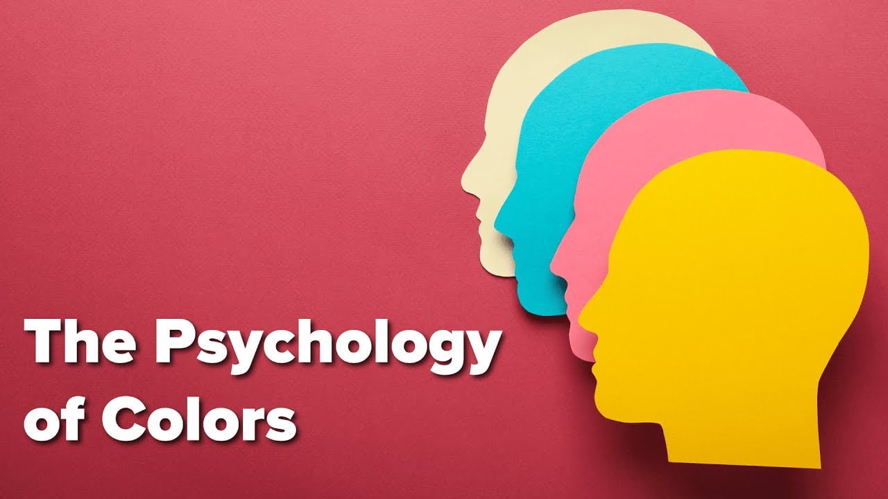
- Understanding the Importance of Colors in Marketing
- Psychology of Colors in Marketing
- 1. Red
- 2. Blue
- 3. Yellow
- 4. Green
- 5. Orange
- 6. Purple
- The Influence of Cultural Factors
- Using Colors Effectively in Marketing
- 1. Consistency
- 2. Contrast
- 3. A/B Testing
- 4. Consider Your Audience
- 5. Use Colors to Highlight Call-to-Action
- Conclusion
- Key Takeaways: Best Colors for Marketing
- FAQs: Best Colors for Marketing
- 1. What role do colors play in marketing?
- 2. How can I choose the best colors for my marketing campaign?
- 3. What colors are associated with trust and reliability?
- 4. Which colors should I use to create a sense of urgency?
- 5. Are there any colors that can enhance creativity and innovation?
- 6. Can colors affect how memorable a brand is?
- 7. Are there any colors to avoid in marketing?
- 8. Can I use multiple colors in my marketing materials?
- 9. How can I create a sense of luxury and sophistication through colors?
- 10. Which colors are popular for attracting attention?
- 11. Are there any colors that elicit a calming effect?
- 12. Can colors influence purchasing decisions?
- 13. How important is color consistency across my marketing materials?
- 14. Should I consider cultural differences when choosing colors?
- 15. Can colors impact website conversions?
Color plays a crucial role in marketing strategies and can have a significant impact on consumer behavior. In fact, studies have shown that 90% of snap judgments about products are based on color alone. It is no wonder that businesses are now focusing on identifying the bestcolors for marketing their products and services. A well-chosen color palette can not only enhance brand recognition but also influence purchasing decisions and create a strong emotional connection with the target audience.

Considered the most powerful color in the marketing world, red is often associated with excitement, passion, and urgency. It grabs attention and evokes strong emotions, making it an excellent choice for creating a sense of urgency or increasing impulsive buying behavior. Many well-known brands, such as Coca-Cola and Netflix, have successfully incorporated red into their logos and packaging to create a sense of excitement and stimulate consumer interest.
On the other end of the spectrum, blue is often associated with trust, reliability, and calmness. It conveys a sense of professionalism and competence, making it a popular choice among financial institutions and technology companies. Blue is also believed to improve productivity and create a sense of tranquility, which is why platforms like Facebook and Twitter use blue prominently in their branding.

Another color that holds great influence in the marketing world is green, which is often associated with health, nature, and sustainability. It represents growth and renewal and is commonly used by brands in the food and wellness industries. Studies have shown that seeing the color green can improve creativity and boost mood, making it a great choice for advertising platforms or online advertising services that want to cultivate positive associations with their brands.
In addition to these primary colors, statistics show that 95% of the top 100 brands use two or more colors in their logo design. This highlights the importance of choosing a color combination that not only captures attention but also reflects the brand’s values and personality. For example, the combination of yellow and black exudes warmth and energy, making it a popular choice for fast-food chains like McDonald’s. Similarly, the use of orange and brown can create a friendly and inviting feel, as seen in the branding of companies like UPS.

In conclusion,.
What Are the Best Colors for Marketing and How Can They Help Your Online Advertising?
When it comes to online advertising, choosing the right colors can significantly impact your campaign’s success. The color palette you select has the power to evoke emotions, create brand recognition, and influence consumer behavior. In this article, we will explore the best colors for marketing and how they can benefit your online advertising efforts. By understanding the psychology behind colors and their impact on human perception, you will be able to make informed decisions that resonate with your target audience and drive conversion rates. So, let’s dive into the fascinating world of color psychology and discover how it can boost your online advertising strategy.

| Item | Details |
|---|---|
| Topic | Best Colors For Marketing |
| Category | Ads |
| Key takeaway | Color plays a crucial role in marketing strategies and can have a significant impact on consumer behavior. |
| Last updated | February 20, 2026 |
Understanding the Importance of Colors in Marketing
Colors play a vital role in marketing. They have the power to evoke emotions, shape perceptions, and influence consumer behavior. In fact, studies have shown that 90% of snap judgments about products are based on color alone. Therefore, choosing the right colors for your marketing campaigns is crucial for capturing the attention of your target audience and driving conversions.
Psychology of Colors in Marketing
The psychology of colors is a fascinating field that explores the impact of different hues on human perception and behavior. Understanding the psychology behind colors can help you make informed decisions when selecting the best colors for your marketing materials.

1. Red
Red is a powerful color that evokes strong emotions such as passion, excitement, and urgency. It grabs attention and increases heart rate, making it an excellent choice for creating a sense of urgency and driving impulse purchases. Red is also associated with high energy, making it suitable for brands in the entertainment or sports industry.
2. Blue
Blue is a calming color that conveys trust, reliability, and professionalism. It is often used by banks, finance companies, and healthcare providers to instill a sense of security in their customers. Blue is also associated with productivity and intelligence, making it a great choice for technology or educational brands.
3. Yellow
Yellow is a vibrant color that evokes feelings of optimism, happiness, and warmth. It grabs attention and is often associated with creativity and youthfulness. Brands that want to convey a sense of cheerfulness and positivity can benefit from incorporating yellow into their marketing materials.
4. Green
Green is commonly associated with nature, growth, and freshness. It represents health, tranquility, and balance. Green is often used by environmentally friendly brands and those in the health and wellness industry. Additionally, green can also be associated with wealth and money, making it suitable for financial and investment institutions.

5. Orange
Orange is a warm and energetic color that combines the passion and excitement of red with the friendliness and cheerfulness of yellow. It is often used to create a sense of enthusiasm and to grab attention. Brands that want to appear friendly, approachable, and full of energy can benefit from incorporating orange into their marketing materials. Orange is commonly used by fast food chains and sports teams.
6. Purple
Purple is a color associated with luxury, royalty, and creativity. It evokes a sense of elegance, sophistication, and exclusivity. Purple is often used by high-end brands to create a sense of prestige and to target a more upscale audience. It can also be associated with spirituality and imagination, making it suitable for brands in the beauty or creative industries.
The Influence of Cultural Factors
While color psychology provides valuable insights into the impact of colors on human perception, it’s essential to consider cultural factors when developing your marketing materials. Colors can have different meanings and associations in different cultures, so what may be perceived positively in one culture could be seen negatively in another.

For example, while red is often associated with love and luck in Western cultures, it symbolizes danger or warning in some Eastern cultures. Similarly, in Western cultures, white is associated with purity and weddings, while it represents mourning in many Eastern cultures. It is crucial to research and understand the target culture’s color symbolism to ensure that your marketing materials are culturally appropriate and effective.
Using Colors Effectively in Marketing
Now that we have explored the psychology behind colors and their cultural influences, let’s discuss how to use colors effectively in your marketing campaigns.
1. Consistency
Consistency is key when it comes to using colors in marketing. Choose a color palette that aligns with your brand identity and stick to it across all marketing materials, from your logo to your website design and advertising campaigns. Consistency builds brand recognition and helps consumers develop a strong association between your brand and the chosen colors.

2. Contrast
Using contrasting colors can help your marketing materials stand out and grab attention. For example, using complementary colors (colors opposite each other on the color wheel) can create a visually appealing contrast that catches the viewer’s eye. However, be cautious not to overuse contrasting colors, as it may create a chaotic or overwhelming design.
3. A/B Testing
When in doubt, conduct A/B testing to determine which colors resonate best with your target audience. Create two versions of your marketing materials, each featuring a different color scheme, and track the performance of each version. By analyzing the data, you can identify which colors drive higher engagement and conversions, allowing you to optimize your marketing strategy.
4. Consider Your Audience
Always consider your target audience when selecting colors for your marketing materials. Different demographics and psychographics may respond differently to specific colors. For example, younger audiences might be more drawn to vibrant and energetic colors, while older audiences might prefer more muted and sophisticated tones. Tailoring your color choices to your target audience can increase the effectiveness of your marketing campaigns.

5. Use Colors to Highlight Call-to-Action
Your call-to-action (CTA) is a crucial element of your marketing materials, and using colors strategically can help draw attention to it and encourage action. Choose contrasting colors for your CTA buttons and text to make them stand out from the rest of the design. Colors that evoke a sense of urgency, such as red or orange, can be particularly effective in driving conversions.
Conclusion
Colors have a profound impact on marketing. Understanding the psychology of colors and considering cultural influences can help you make informed decisions when selecting the best colors for your marketing campaigns. Consistency, contrast, A/B testing, and audience consideration are key factors to consider when incorporating colors into your marketing materials. By leveraging the power of colors effectively, you can capture attention, shape perceptions, and drive successful marketing campaigns.
Remember, 90% of snap judgments about products are based on color alone, so choosing the right colors for marketing is of utmost importance in the competitive digital advertising landscape.
Research suggests that colors can increase brand recognition by up to 80%.
Key Takeaways: Best Colors for Marketing
When it comes to marketing, choosing the right colors can significantly impact the success of your campaigns. The psychology of color plays a crucial role in how consumers perceive your brand, products, and services. By selecting the most appropriate colors, you can evoke specific emotions and convey messages that resonate with your target audience. In this article, we will explore the best colors for marketing and how they can be utilized to optimize your online advertising efforts.
- Understanding the psychology of color: Colors have the power to trigger certain psychological responses. By studying the effects of different colors on human emotions, you can strategically select colors that align with your brand’s personality and desired consumer reactions.
- Red for attention and urgency: Red is a color that grabs attention and creates a sense of urgency. It is often used for promotions, clearance sales, or call-to-action buttons in online advertising campaigns.
- Blue for trust and security: Blue evokes feelings of trust, reliability, and security. It is commonly used by banks, insurance companies, and tech brands to instill a sense of confidence in their offerings.
- Green for nature and wealth: Green is associated with nature, health, and wealth. It is often used by eco-friendly or sustainable brands, as well as financial institutions highlighting their investment services.
- Yellow for optimism and positivity: Yellow is a color that radiates optimism, happiness, and positivity. It is frequently used to attract attention to important information and create a sense of enthusiasm.
- Orange for energy and creativity: Orange is a vibrant color that stimulates energy, creativity, and enthusiasm. It is commonly used to promote innovative products or services.
- Purple for luxury and creativity: Purple is associated with luxury, royalty, and creativity. It is often used by high-end brands or to portray a sense of exclusivity.
- Black for sophistication and authority: Black is a color that exudes sophistication, elegance, and authority. It is frequently used by luxury brands or to create a sleek and powerful image.
- White for simplicity and purity: White symbolizes simplicity, purity, and cleanliness. It is commonly used in minimalist designs or to create a sense of calmness and clarity.
- Combining colors for impact: A well-thought-out color scheme that combines multiple colors can create a powerful impact. Understanding color harmony and contrast is essential to create visually appealing and engaging marketing materials.
- Consider cultural associations: Colors can have varying cultural and regional associations. When targeting an international audience, it is important to consider the cultural meaning of colors to avoid any unintended negative connotations.
- Test and analyze: It is crucial to test different color combinations and analyze their impact on your target audience. Conduct A/B testing to determine what colors resonate best with your consumers and drive the desired actions.
- Understand your target audience: The preferences and emotions triggered by colors can vary based on different demographics and target markets. Tailor your color choices based on your understanding of your specific target audience to effectively connect with them.
- Consistency across channels: Maintaining consistency in your brand’s color scheme across various marketing channels helps build brand recognition and fosters a sense of trust and familiarity among your audience.
- Adaptability to trends: While timeless colors exist, it is important to adapt to evolving design and color trends to keep your marketing materials fresh and appealing to modern consumers.
- Don’t underestimate the importance of color: Colors have the ability to influence consumer behavior, evoke emotions, and create memorable impressions. Choosing the best colors for your marketing efforts should be a thoughtful and strategic process to maximize impact.
By implementing the insights provided in this article, you can leverage the power of colors to enhance your online advertising campaigns and effectively communicate your brand’s message to your target audience.
FAQs: Best Colors for Marketing
1. What role do colors play in marketing?
Colors have a significant impact on consumer behavior and can evoke different emotions, influence purchasing decisions, and improve brand recognition.
2. How can I choose the best colors for my marketing campaign?
Consider your target audience, brand personality, market trends, and cultural significance of different colors. Conduct thorough research and perform A/B testing to determine the most effective color scheme.
3. What colors are associated with trust and reliability?
Blue and green are commonly associated with trustworthiness, reliability, and stability. These colors are often used by financial institutions and healthcare brands.
4. Which colors should I use to create a sense of urgency?
Red is known to create a sense of urgency, promoting quick decision-making. It can be effective for limited-time offers or flash sales.
5. Are there any colors that can enhance creativity and innovation?
Colors like purple and yellow are often associated with creativity and can be used to stimulate innovative thinking. Many technology and creative industries incorporate these colors in their branding.
6. Can colors affect how memorable a brand is?
Absolutely! Choosing distinct and memorable colors can significantly improve brand recognition. Consistency is key, so ensure your chosen colors are incorporated across all marketing materials and platforms.
7. Are there any colors to avoid in marketing?
While there are no hard-and-fast rules, it is generally advisable to avoid using too many clashing colors or controversial color combinations that may confuse or alienate your target audience.
8. Can I use multiple colors in my marketing materials?
Using multiple colors can be effective, but it’s important to maintain visual harmony and avoid overwhelming your audience. Stick to a cohesive color palette and use colors strategically to convey your message.
9. How can I create a sense of luxury and sophistication through colors?
Colors like black, gold, and silver often convey a sense of luxury and sophistication. These shades are commonly used by high-end fashion brands and luxury goods manufacturers.
10. Which colors are popular for attracting attention?
Bright and bold colors such as red, orange, and yellow are known to grab attention quickly. However, be mindful of using them sparingly to avoid overwhelming your audience.
11. Are there any colors that elicit a calming effect?
Soft and muted colors such as pastel blues, greens, and lavenders are often associated with calmness and tranquility. These colors are frequently used by spa and wellness brands.
12. Can colors influence purchasing decisions?
Absolutely! Different colors can evoke different emotional responses from consumers, which can ultimately impact their purchasing decisions. Understanding your target audience and their associations with colors is crucial.
13. How important is color consistency across my marketing materials?
Color consistency is vital as it helps establish brand recognition and fosters a sense of familiarity among consumers. Ensure your chosen colors are consistently used in all your marketing materials for maximum impact.
14. Should I consider cultural differences when choosing colors?
Absolutely! Colors can carry different meanings in various cultures. It’s important to consider cultural associations and preferences when using colors in your marketing campaigns, especially in diverse markets.
15. Can colors impact website conversions?
Yes, the color scheme of your website can significantly impact user experience and conversions. Conducting A/B testing with different color combinations can help determine which colors drive the highest conversions for your specific audience.
Conclusion
In conclusion, choosing the right colors for marketing is crucial for online advertising services and advertising networks. Throughout this article, we have explored the impact of colors on consumer behavior, and it is evident that colors play a significant role in shaping our perception and influencing purchasing decisions.
Firstly, we discussed the importance of understanding the psychology of colors. Different colors evoke different emotions and have various cultural associations, making it essential to choose colors that align with the message and target audience. Warm colors like red and orange can create a sense of urgency and excitement, making them ideal for limited-time offers or call-to-action buttons. On the other hand, cool colors such as blue and green can create a feeling of trust and relaxation, making them suitable for brands that want to convey a sense of calm and security. By considering the psychology of colors, online advertising services and advertising networks can effectively communicate their message to potential customers.
Furthermore, we delved into the significance of color contrast and readability in marketing materials. It’s crucial to ensure that the chosen color palette provides enough contrast to make text and other vital information easily readable. High contrast between text and background colors is particularly important for display ads, website design, and mobile apps. Additionally, we discussed the impact of color personalization and customization in marketing campaigns. By adapting the color scheme to match the preferences of specific target audiences, online advertising services and advertising networks can make their advertisements more engaging and personalized, leading to higher conversions and brand loyalty.
It is worth mentioning that cultural considerations should not be overlooked when selecting colors for marketing. Colors may carry different meanings in different cultures, and it is vital to be aware of these cultural subtleties to avoid any miscommunication or offense. Conducting thorough research on the target audience’s cultural background can help online advertising services and advertising networks choose appropriate colors that resonate positively with potential customers.
Moreover, we explored the role of color in branding and establishing brand identity. Consistency in color usage across different marketing channels helps create a strong and recognizable brand presence. By consistently employing the same colors in advertisements, website design, and social media campaigns, online advertising services and advertising networks can reinforce brand recognition and build trust with their audience.
In conclusion, the choice of colors in marketing plays a crucial role in influencing consumer behavior and perception. Understanding the psychology of colors, ensuring proper contrast and readability, considering cultural differences, and establishing consistent brand identity all contribute to effective advertising for online advertising services and advertising networks.